Il centesimo meridiano, in Nebraska, non è soltanto la linea immaginaria che separava est e ovest, e che attraversa gli stati del Nord e Sud Dakota, del Nebraska appunto, Kansas, Oklaoma e Texas. E non è neanche “Where the West begins”, “dove comincia il West” come recitava un vecchio adagio per turisti. Il Nebraska è un luogo di solitudini e attraversamenti.
La ricerca artistica del fotografo Andrew L. Moore, con Dirt Meridian (2005-2014), prova a tracciarne una geografia personale e collettiva, alla ricerca di quel sottile filo rosso che disegna una trama fittissima di storia, leggenda, film, pubblicità, viaggi ed esperienze individuali. Dettagli di una stanza dimenticata, caseggiati abbandonati eppure ancora maestosi, lande battute da venti e neve.
La giornalista Inara Verzemnieks, del New York Times parla così di questi territori e del progetto fotografico: “Casa di Budd si trova in una zona che vecchie mappe, una volta, avvertivano non presentare altro che polvere. “Una soggiorno inadatto a chiunque, se non a una popolazione nomade”, così aveva concluso un membro di una spedizione governativa degli Stati Uniti, inviata intorno al 1820, per determinare se le terre a ovest del 100° meridiano fossero luoghi in cui una persona poteva ragionevolmente aspettarsi di poter vivere. Quasi due secoli dopo, il territorio già noto come il Gran Deserto americano, resta una delle regioni più scarsamente popolate del paese, con le contee di un gruppo di stati spesso ospitanti, entro i propri confini, molte più miglia quadrate che residenti. E ogni anno, queste contee vuote – che si estendono ad ovest del 100° meridiano passando per le Grandi Pianure fino alla base delle Montagne Rocciose – si espandono sempre più vuote, dal momento che la terra dirada ulteriormente costantemente i già scarsi abitanti sparsi qua e là”.
Proprio per questa solitudine epica, in questi scatti, il singolo, le case isolate, i paesaggi aridi e infiniti finiscono per assumere un’aria monumentale.
In un’intervista del 2001 Moore dichiarò: “Non sono un vero fotografo documentarista. Non sto tentando di documentare una decadenza. Cerco luoghi carichi di significato”. E continuava: “I miei interessi fotografici sono sempre stati legati all’impegnativa intersezione della storia, in particolare a quei luoghi in cui le molteplici tangenti del tempo si accavallano e si aggrovigliano. In altri paesi che ho fotografato, come a Cuba e in Russia, questi meandri del tempo hanno creato una narrazione storica densamente stratificata”.
Andrew L. Moore School District 123 Cherry County
Spirito del luogo dunque. E, al tempo stesso, luoghi dello spirito, americano in questo caso, che tuttavia assurgono a riflessione sulla condizione esistenziale dell’uomo. Uncle Teed ha la grandezza dei grandi vecchi di Rembrandt, o del Vecchio disperato di Van Gogh. Una luce netta batte da sinistra concentrandosi sull’intera figura: il viso, le mani, lo sguardo perso nel vuoto. Una seconda fonte di luce, più arretrata, è abbastanza per evidenziare un salotto ormai consunto, eppure memore dei tempi andati. Le pause di luce e di ombra disegnano quei “meandri del tempo” cari al fotografo. Proprio come i segni e le scritte, ormai inintelligibili, della lavagna di School District 123, i paesaggi, fotografati da un aereo, si dipanano nelle loro fitte trame di crinali, mulattiere, staccionate, ferrovie, corsi d’acqua, vapori, nebbie.
Su tutto, come la neve leggera di Buckboard Wagon, la patina del tempo.
Alcune brevi riflessioni su un’interessante opera di Kan Xuan, Millet Mounds (2012).
L’opera si compone di oltre 200 piccoli schermi, ognuno dei quali trasmette, in loop, un video con una sequenza rapidissima di foto. Ogni sequenza documenta una tomba imperiale cinese e il suo modo di entrare o meno in relazione con gli abitanti del luogo. Il titolo stesso nasce dal sostantivo usato dagli abitanti dei villaggi in Cina settentrionale per riferirsi ai tumuli tombali che essi vedono come mucchi di covoni di grano. Tumuli, dettagli archeologici, alberi, piante, strade, volti, biciclette, festoni: tutto entra nella narrazione di Kan Xuan
Un paesaggio interiore ed esteriore, dunque, spesso lontanissimo dai luoghi e dagli stereotipi del turismo di massa, in quanto molti di questi sepolcri sorgono in luoghi remoti e dimenticati.
Nell’ottimo articolo che Tom J.L. Baxter ha dedicato a questa artista, si legge:
“In ogni caso, il proposito di Kan Xuan non è fornire spiegazioni sulla storia di queste tombe, ma piuttosto di intraprendere una duplice esplorazione della loro realtà presente. L’artista si concentra, in primo luogo, sulla composizione di questi eccezionali peasaggi ibridi e sul modo in cui le creazioni umane e quelle naturali si sono reciprocamente mescolate. In secondo luogo, Millet Mounds si concentra sul significato dell’essere nel presente e immersi in un’interazione quotidiana con un paesaggio del passato, cioè su come le persone nella vita di tutti i giorni entrino in rapporto e comprendano questo ambiente così particolare”.
Ora, se è vero che Millet Mounds indaga un ibrido tutto contemporaneo, cioè l’intersezione dell’oggi con un oggetto del passato, è tuttavia possibile ravvisare un interessante parallelismo con una famosa pellicola degli anni Quaranta.
Ciò a riprova del fatto di essere di fronte a un’opera che affronta uno dei grandi temi esistenziali nonché artistici: il tempo.
Il film in questione è “Primavera in una piccola città” di Fei Mu, la cui trama, piuttosto semplice, ruota attorno al classico triangolo amoroso, ai drammi interiori, al dilemma tra doveri familiari e il sogno di un amore giovanile.
L’elemento interessante risiede nel fatto che i protagonisti, in ben 4 sequenze diverse, parlano della propria vita, o di un momento di essa, mettendola in relazione alle antiche mura della cittadina, di cui peraltro non si vedono che frammenti.
Ora, questa relazione crea uno stato d’animo particolare nei personaggi, una sorta di una vaghezza tra ciò che è e ciò che avrebbe potuto o potrebbe essere.
Una tema, dunque, trattato con una sensibilità talmente moderna da essere stato, il film, rifiutato, per decenni, dal Partito Comunista Cinese che vi ravvisava un inaccettabile disimpegno politico, nonché un’involuzione reazionaria piccolo-borghese (rivalutato negli anni Ottanta, il film, viene attualmente annoverato tra i grandi classici cinesi).
Degno di nota è proprio questo sentimento di indeterminatezza che le immagini di Kan Xuan condividono, in modo del tutto inconsapevole evidentemente, con il film.
L’artista Kan Xuan impegna il proprio sguardo sulla Cina contemporanea e su come il passato vi entri in relazione.
Ne nasce un’epica del vissuto che, pur concentrandosi sul presente, allude a un sentimento di lontananza dei singoli, non a caso ripresi alternativamente alle tombe e alla natura, come a evocare una riflessione sul passare del tempo e sulle stratificazioni storiche dei luoghi e delle comunità che li abitano.
minuto 1 (Yuwen, la moglie, cammina lungo la muraglia della città)
Vivere in una piccola cittadina, condurre un’esistenza in cui non cambia mai nulla. Ogni giorno, dopo aver comprato da mangiare, amo camminare per un po’ lungo la sommità delle mura cittadine. Ormai è divenuta un’abitudine….Camminando sulla muraglia, mi sento come se mi fossi lasciata questo mondo alle spalle. I miei occhi non vedono più nulla. La mia mente è vuota. Se non fosse per il cestino pieno di cibo e per i medicinali per mio marito, potrei evitare di andare a casa per l’intera giornata.
minuto 32 (I 4 personaggi passeggiano lungo le mura cittadine)
Yuwen, la moglie: “Usciamo per una passeggiata; nessuna meta in mente in particolare. Finiamo per arrivare alle mura della città. Cammino dietro di loro. Ma lui, si ferma e mi aspetta”.
minuto 35-36
Zhang Zhicheng, il dottore: “Dopo colazione, trova una scusa così che possiamo uscire per una passeggiata insieme. E parlare”.
Yuwen: Dove andiamo?
Zhang Zhicheng, il dottore: “Alle mura”.
(Presso le mura)
Yuwen, la moglie: “Un sentimento di vulnerabilità. su queste vecchie mura crollate e scavate”.
Zhang Zhicheng, il dottore: “Come ti senti a trascorrere la vita quassù?”.
Yuwen, la moglie: “Stare così….beh potrei trascorrerci l’intera giornata”.
minuto 45
Zhang Zhicheng, il dottore: “Sembra che tutti voi amiate venire quassù, sulla sommità delle mura cittadine, a trascorrere un po’ di tempo. Come mai?”.
Dai Xiu, la sorellina: “A ben guardare è l’unico posto interessante in città. Potresti camminare sulle mura per sempre e accorgerti guardando in lontananza che non riesci a distinguere alcunchè tanta è la distanza allora inizi a capire che il mondo dopotutto non è così piccolo. (…) Prendi ad esempio Sorella maggiore, ogni giorno, dopo la spesa, passeggia sulla muraglia. Forse è l’unico modo che ha di evadere, e solo per questo trova il coraggio di andare avanti”.
A few brief comments on an interesting work by Kan Xuan, Millet Mounds (2012).
Millet mounds consists of more than 200 small screens, each of them broadcasting a brief, looped video. Kan Xuan uses a stop-motion technique, stitching together hundreds of individual still photographs.
Each series documents a Chinese imperial tomb and the way it is in relationships with local people. The installation takes its title from the nickname used by Northern Chinese villagers to refer to burial mounds by virtue of their resemblance to the grain stacks. Burial mounds, archaeological details, trees, plants, streets, faces, bicycles, festoons: everything enters into the narrative of Kan Xuan An interior and exterior landscape, often far away from the places and the stereotypes of mass tourism, since most of these tombs are located in remote and forgotten places . In the excellent article Tom J.L. Baxter has dedicated to this artist we can read:
“Kan Xuan’s purpose however, is not to provide an explication of the history of these tombs, but rather to engage in a twofold exploration of their present reality. She is focused in the first instance on the composition of these remarkable hybrid landscapes, the ways in which “man-and nature-made” have become fully intermeshed. Secondly, ‘Millet Mounds’ concentrates on what it means to be of the present and in daily interaction with a landscape of the past, on how people in their everyday lives negotiate an understanding of this particular environment”.
Now, while Millet Mounds, on the one hand, investigates a typical contemporary hybrid, the intersection of past and present, on the other hand, it is still possible to establish an interesting parallel with a famous Chinese movie from the Forties. This proves we are in front of a work that focuses on one of the most important existential and artistic subject matter: the time.
The movie we are talking about is “Spring in a small town” by Fei Mu.
One of the interesting things is the fact protagonists, in 4 different sequences, talking about their lives, or about a moment of it, they relate it to the ancient town walls, of which, however, we do not see anything but fragments.
Now, from this connection mixed feelings arise in the main characters, a sort of desire between what is and what it could or it could have been.
A modern sensitivity persuades Fei Mu to treat such a subject in such original way. Just for this reason Chinese Communist Party rejected the film for decades stigmatizing its political disengagement as well as its petty-bourgeois mentality.
(“rehabilitathed” in the Eighties, the film is currently ranked among the great classics of Chinese film)
It is precisely this sense of daydreaming (a sort of feeling of haziness) that the images by Kan Xuan share with it, unconsciously of course. Kan Xuan casts a glance at the contemporary China and how its past enters into relationship with its present. So there it is, an epic novel of an experience focused on the present and yet on a feeling of remoteness of individuals. It is not by coincidence that the slides show alternatively the landscape, several details in nature, the graves, the archeological ruins and local people, as to evoke a reflection on the flow of time, the historical layers of a site and their relationship with the communities living there.
VOICEOVER (V/O): Living in a small town, living a life where nothing ever changes. Everyday after I’m done buying groceries I like to walk for a while along the top of the city wall. It’s already become a habit with me. Walking along the city wall, I feel as if I’ve left this world behind. My eyes see nothing. My mind is empty. If it weren’t for the vegetable basket on my arm and the medicine for my husband in my hand, I might not go home all day.
SUBTITLE: Wei Wei As Zhou Yuwen, the Wife
min 32
[The four characters walk along the city wall]
Yuwen, the young wife V/O: We go out walking with no particular destination in mind. We somehow end up on the city wall. I walk behind the rest of them. He…he stands and stops and waits for me.
min 35-36
ZZC, the doctor: After breakfast, make up some excuse so that we can take a walk together. And talk things over.
YuWen: Where to?
ZZC: The city wall.
[cut to city wall]
V/O: A feeling of helplessness. Atop this broken-down and hollowed-out old city wall.
ZZC: How long do you feeling like spending up here?
YW: Being like this… I could spend all day.
min 45
ZZC, the doctor: It seems that you all like to come up to the top of the city wall. Why’s that?
DX, thr young sister: This is the only interesting place in town. You can walk along the wall forever and when you look so far into the distance that you can’t see anything at all you start to realize that the world isn’t so small after all. You know, Big brother Zhang, in a small town like this, and especially with a family like ours, you could suffocate to death. Take Big Sister: everyday when she’s done with the grocery shopping, she walks on the city wall. Maybe that’s the only way she can let go a little and it’s only after she lets go that she finds the courage to go on. Big brother Zhang? What are you thinking about? Did you hear a word I just said?
La suggestione è ciò che permette all’opera di essere autonoma dal suo autore, provoca l’immaginazione e permette a chi la guarda di appropriarsene. (Giuseppe Penone)
Un’esperienza multisensoriale, una scultura come organismo complesso, in bilico tra organico e inorganico: ecco la natura di molte opere di Giuseppe Penone.
Sculture di linfa, creata nel 2007, è stata presentata alla 52 Biennale di Venezia entrando successivamente nella collezione permanente del MAXXI di Roma.
Nell’installazione le pareti della sala sono costituite da pelli di cuoio che, opportunamente trattate, evocano la corteccia degli alberi; il pavimento, in marmo bianco venato, presenta una lavorazione a bassorilievo, “un’impronta a forma di cervello” la definisce Penone. Al centro della stanza, posta in diagonale, una trave in legno, scavata, percorsa da un rivolo di resina rossa.
Penone stesso ne spiega la genesi:
“La scorza è sicuramente la parte più affascinante del tronco, ma ha un legame anche con i miei lavori dei primi anni settanta sul contatto con i materiali e le superfici. La scultura è un qualcosa che avviene soprattutto attraverso il toccare e l’agire, e quindi è molto importante il tatto, il rapporto con la materia. C’è sempre uno spazio tra la mano che tocca e la cosa toccata. può essere anche solo l’unto dell’impronta digitale, però esiste, è uno spazio minimo che divide il nostro corpo dalla cosa toccata. Bagnare una pelle di mucca, un pezzo di cuoio, e farla aderire a una superficie è mettere in evidenza uno spazio come quello che c’è tra la mano che tocca e la cosa toccata. ho usato il cuoio, una pelle, conciata con un estratto vegetale, il metodo più antico perché si può modellare con l’acqua e una volta essiccata mantiene inalterata la forma voluta. Le pelli sono state adagiate sulla scorza di un tronco e, attraverso un’azione di battitura, si è ricreato il disegno della scorza sulla pelle animale. Le pelli che nell’installazione ricoprono le pareti della stanza avvolgono lo spazio vuoto come avvolgevano il tronco. E’ come essere all’interno del tronco. Il vuoto è sottolineato anche dall’opera scultura di linfa. Gli odori sono parte integrante di questa installazione. C’è l’odore forte della pelle e l’odore della resina che si confondono. Entrano in gioco diversi elementi, che dovrebbero dare una lettura e una sensazione particolare dello spazio e del processo del lavoro. Una ritualità della scultura e del fare scultura, priva di altri valori e simbologie”.
Ancora una volta, Penone lavora su un tema a lui caro: l’impronta.
In una intervista rilasciata nel 2007, lo scultore dice a riguardo:
“L’impronta è un’immagine automatica che lasciamo ogni giorno su migliaia di cose, ogni cosa che tocchiamo produce un’impronta. Un’immagine animale, un’immagine che non ha cultura, che non produce cultura, produce la testimonianza di un vissuto, ma non è assolutamente un prodotto culturale”.
Queste parole non devonono sorprendere: Penone ha sempre difeso l’idea che “l’immagine non sta per”, ma, al contrario, “è”, esattamente come nelle opere paleolitiche da lui tanto ammirate.
L’impronta è un elemento particolare: traccia manifesta e misteriosa al tempo stesso. Vicina, perchè familiare, e lontana perchè manifestazione di un’assenza.
Ritroviamo le parole del critico Didi Huberman che vede nell’impronta un “anacronismo”, qualcosa che lega dialetticamente passato e presente, un elemento senza tempo perchè capace di far incontrare passato e presente.
Si rivela così l’intreccio tra memoria e presente, tra presenza e assenza, tra somiglianza e rappresentazione così basilari in tutta l’opera di Giuseppe Penone.
G
iuseppe PenoneSculture di linfa 2007 marmo di Carrara, cuoio, legno, resina dimensioni ambiente Collezione permanente MAXXI Arte
Penone, Sap sculptures, photo by Patrizia TocciGiuseppe Penone
Giuseppe Penone(Sap sculptures) Sculture di linfa, 2007 Carrara marble, leather, wood, resin. Room-size. Permanent collection MAXXI Arte
“Power of suggestion is what enables a work to become independent of its creator. It works on the imagination and allows the viewer to appropriate it”. (Giuseppe Penone)
In Sculture di linfa (Sap Sculpture, 2007) by Italian sculptor Giuseppe Penone the leather walls, by a tanning process, evoke the bark of a tree. The veined white marble covers the whole surface of the room, in the centre there is a sort of bas-relief, “there is an imprint in the form of the brain”. On the floor a horizontal tree cut lengthwise to create two halves the hollowed out, with red resin poured into it.
Penone describes his work:
“The bark is definitely the most fascinating part of the trunk, but this sculpture is also related to my works back in the early Seventies on contacts with materials and surfaces. Sculpture is created above all trough touch and gesture. Touch is very important, the rapport with matter. There is always a space between the hand that touches and the touched thing. It is may be just the oil on the fingertips, but it still exists, a tiny space separating our bodies from the thing we touch. Wetting a piece of cowhide, a piece of leather, and
making it cling to a surface brings out a space as what there is between the hand that touches and the touched thing. I used animal hides tanned with a vegetable extract, the most ancient method, because you can model it by wetting it with water, and then, once it dries it keeps the form unchanged. The hides were wrapped around the bark of a tree trunk and then beaten to recreate the pattern of the bark on the animal skin. The skins covering the walls of the room in the installation envelop the empty space just as they were formerly wrapped around the trunk. It is like being inside the tree trunk. Scultura di linfa (Sap Sculpture) is another work that stresses the void. Odours are an integral art of this installation. There is strong smell of leather which mingles with the smell of the resin. Different elements interact. They are ment to offer a special interpretation and create a special sensation of the space and the process of the work. It is a ritual of sculpture and the way sculpture is made, devoid of other values or symbolism”.
Once again, Penone works on a subject dear to him: the imprint.
In a 2007 interview, the sculptor stated: “The imprint is an automatic image that we etch every day on thousands things, everything we touch receives our imprint. It is a image belonging to Animals, an image that has no culture, neither produces culture, it testifies of a life lived, but it is not a cultural product.”
These words do not surprise: Penone has always supported the idea that “the image does not stand for” but, on the contrary, “it is”, exactly as in the Palaeolithic works he admired. Footprints are particular elements, obvious and mysterious at the same time. Close, because well-acquanited, and yet far because absent.
It Reminds of Didi Huberman: the imprint is a sort of ” anachronism “, something that ties dialectically past and present, i.e. a timeless element because it connects past and present.
In conclusion, it reveals the weaving between the past and the present, between the presence and the absence, between the resemblance and the representation so important in Giuseppe Penone’s work.
Se ne trova testimonianza già presso i persiani, oggetto regale, nonché presso i cinesi nel XIII secolo a.C.
Il fazzoletto ha attraversato mode ed epoche: oggetto di lusso, segno di frivolezza e seduzione, status symbol, si è arricchito nei secoli di colori e ornamenti, fino a tramontare definitivamente dopo la I Guerra Mondiale. Soppiantati, quindi, dai fazzoletti di carta.
Tra i primi esempi che la storia ricordi di “messaggi” legati al dono di un fazzoletto, troviamo Cleopatra. La regina egizia, infatti, inviava, come pegno d’amore, fazzoletti intrisi di lacrime a Marco Antonio.
Questo preambolo per introdurre una breve riflessione su forme d’arte non convenzionale.
Cindy Sherman, coinvolta in un progetto curatoriale alla 55 Biennale di Venezia, ha presentato infatti i Paños, fazzoletti decorati a mano dai carcerati, generalmente messicani, diffusi nei penitenziari americani sudoccidentali.
Creati da detenuti che spesso vi si specializzano, offrendo talvolta “manodopera” ai meno esperti, questi panni svelano un cosmo di pensieri, ricordi ed emozioni che contrastano fortemente con il carattere disumanizzante della prigionia.
I panni nascono in un preciso contesto “interno”, nell’economia carceraria, dove hanno un valore intrinseco e sono destinati a persone care, amici, parenti e, in passato, perfino a donne desiderose di avere una corrispondenza inusuale con carcerati.
“L’esterno” a cui sono indirizzati è pertanto un luogo altrettanto chiuso, “intimo”.
Ecco allora che il riconoscimento di questi oggetti d’affezione a opere d’arte coincide con un atto voyeuristico. Quelli che, per definizione, nascono come spazi privati, teatro di sogni, speranze, paure, delusione, diventano, sotto gli occhi dello spettatore, un’esplorazione su aspetti sconosciuti, talvolta tabù, di chi è emarginato dalla società.
In the Persian civilization, as well as in China, these regal objects existed since the XIII century B.C. Handkerchiefs, veils and scarves have traveled trough time and have gone trough fashion phases: as luxury objects, signs of frivolity and seduction or status-symbol, they were enriched by the time being with colors and ornaments, until to fade definitely after the 1st world war. Hence, replaced by tissue handkerchiefs. Amongst early examples history reminds, likely messages tight to the handkerchiefs, we find Cleopatra. The Egyptian queen used to ship veils socked by her tears, to Mark Antony, as a token of her love.
This preamble to introduce a short reflection on not-conventional forms of Art.
Cindy Sherman, involved in a specific project at “The 55 Biennale of Venice” (2013), has therefore presented ‘Los Paños’ at the exhibition, decorated hand-made handkerchiefs created by jailed people, mostly Mexicans, spread inside the southwest U.S. penitentiaries. These kerchiefs, created by specialized prisoners, who often offer their qualified workmanship to newcomers, reveal a universe of thoughts, memories and emotions which are in contrast with the inhuman character of imprisonment.
This form of Art was born within a specific context, the prison, possessing intrinsic value to be destined to parents, relatives and friends and, in the past, also to women willingly to have unusual correspondence with the prisoners.
Hence, the outer environment these objects are directed to, remains still ‘close and intimate’.
Here is, then, the recognition of these objects of affection, work of Art, coinciding with a ‘voyeuristic act’. Those works that, by definition, are created as private spaces, theatre of dreams, hopes, fear or delusion, they become under the spectators’ eyes an exploration into unknown aspects, sometimes taboos, of those ones marginalized by society.
A forest of art works in the Star grove, several sculptures in the Water parterre, or displayed further along the Grand Perspective: we are in the Palace of Versailles at the Italian sculptor Giuseppe Penone’s exhibition (summer 2013).
Elevation is right there, in the garden.
It consists of a bronze tree trunk encircled by five living trees.
Floating above the ground, the bronze tree is fixed at a height of more than one meter. The ends of the bronze roots pass through the living trees.
By this method, it seems the bronze tree grows on natural roots.
“As they grow, the trees incorporate their steel supports and eventually a mark will appear in the bark, as if they were raising off the bronze by their growth. In this way an architectural space will be formed, a dome in which the bronze element is suspended”.
The bronze cast and the trees have a symbiotic relationship. In fact, it becomes impossible to distinguish the real trees and the artificial-one.
They become “inseparable, with the bronze taking on the color of the vegetation, camouflaging itself with the vegetation, justified by its own nature and the technique used in its making”.
Penone described his sculpture in this way:
“Elevation
Bronze casting is based on the falling of the molten bronze.
The system of vents necessary to the pouring distributes the metal in the void of the matrix by the force of gravity. From a central pouring the metal runs into the peripheral ramifications of the vents to form the surface of the sculpture.
The metal, with its fall, pushes out the air from the matrix creating a circulation.
To make the vents, reeds or tree branches have always bee used.
The invention and conception of the bronze casting embodies a deep knowledge and reflection on the growth of vegetation.
The tree, with its fluid form, exemplifies the falling towards the light of matter, and the branches, with their extension, nourish the foliage that is equivalent to the surface of sculpture in bronze.
The matrix that enfolds the tree is the air.
The bronze testifies to the profound tie that exists between its cast and the growth of vegetation.
The weight of a tree bronze that rises above the ground sustained by the growth of the trees that surround it is the sculpture (2000)”.
Penone’s sculptures provide some interesting food for reflection.
First of all, by redefining the concept of time, space, and action.
Time
In Elevation, Time holds considerable sway: the art work continues to change
The passing time is a part of the sculpture itself: the trees grow, change, and die.
They, probably, will be replaced in a “restoration” which will highlight how Elevation lives in a circular, cyclical time.
Space
All the works by Penone are related to “the spirit of place”, i.e. they have deep roots in natural events (as demonstrated, for example, by the use of fallen trees) and also, they enter new territory, through the artistic act, far from “art for art’s sake”, in search of a synesthetic experience.
That is why, on the occasion of the exhibition, he said:
“The garden is an emblematic place which summarizes the Western thought about the relationship between man and nature. Built to enhance man’s power, on the contrary, it emphasizes the forces of nature while playing down the importance of man’s tactics, since man is eternally struggling to preserve it.
The complexity of the design suggests the variety of looks. Its great extension contrasts with the tiny size of the one who crosses. Each individual disappears in such garden of the spirit of human collectivity generated by such an organization of the natural world.
My work leads me to draw a similar conclusion: the mimesis (mimicry) of my works neutralizes my action as a sculptor, and focuses on the extraordinary intelligence of the plant growth and the perfect aesthetic quality we can find in nature”.
Action
Penone’s art is an action in dialogue with the matter, a never-ending fluctuation between natural and artificial, between the living thing and the created one (artistically speaking) whose meaning lies in an interplay of affinities and differences, of similarity between the things, i.e. what the critic Didier Semin has called a “poetic mise-en-scene of analogous things .”
“The project – Semin continues – both extraordinarily modest and extraordinarily ambitious, of modern art, is to work not in accordance with nature, to reproduce its image, but as nature, penetrating its secrets. It is like an apprentice who imitates the gestures of his master. In the theories of its creators (such as Klee, but I could cite numerous other examples), this method justifies the total or partial abandonment the principle of imitation of appearances which bounded the horizon of the fine arts for centuries”.
Excerpt from:
Giannelli Ida (editor) Giuseppe Penone. Sculture di linfa. La Biennale di Venezia. 52ª Esposizione internazionale d’arte. Padiglione italiano, Mondadori Electa 2007. Bilingual edition, Italian-English
GIUSEPPE PENONE, ALLA RICERCA DELLO SPIRITO DEL LUOGO.
Nella recente mostra di Giuseppe Penone, alla reggia di Versailles (estate 2013), sono state esposte una serie di creazioni-scultura, le più significative degli ultimi anni, sia all’interno del Palazzo che nei magnifici giardini.
Spiccava, tra le altre, nel boschetto dell’Etoile, Elevazione.
Elevazione è costituito da un albero in bronzo cinto da cinque alberi viventi.
Sospesa a un metro e mezzo da terra, la scultura ha le radici sostenute da piantoni d’acciaio, tutori dei cinque alberi veri e propri, che diventano così le radici di quello in bronzo.
In questo modo, l’albero, pur essendo di metallo, cresce su radici naturali. “Gli alberi crescendo inglobano gli elementi di sostegno in acciaio e nel tempo si vedrà sulla loro corteccia un segno, come se nella loro crescita sollevassero il bronzo. Si formerà così uno spazio architettonico, una cupola nella quale l’elemento in bronzo è sospeso”.
L’oggetto in bronzo e gli alberi hanno un rapporto simbiotico, dal momento che diventa impossibile distinguere gli alberi veri da quello artificiale.
Essi diventano “non più separabili, dove il bronzo acquista il colore della vegetazione mimetizzandosi con il vegetale, giustificato dalla sua stessa natura e dalla sua tecnica di realizzazione.
Giuseppe Penone la descrive così:
“Elevazione.
La fusione in bronzo è basata sulla caduta del bronzo fluidificato.
Il sistema di canalizzazioni necessario alla colata, distribuisce il metallo nel vuoto della matrice per forza di gravità.
Da una colata centrale il metallo scorre nelle ramificazioni delle canalizzazioni periferiche per formare la superficie della scultura.
Il metallo, con la sua caduta, spinge fuori l’aria dalla matrice creando una circolazione.
Per le canalizzazioni si utilizzano, da sempre, delle canne oppure dei rami di albero.
L’invenzione e la concezione della fusione in bronzo racchiude una profonda conoscenza e riflessione sulla crescita
del vegetale.
L’albero esemplifica, con la sua fluida forma, la caduta verso la luce della materia, ed i rami, con la loro estensione, nutrono il fogliame che equivale alla superficie della scultura in bronzo.
La matrice che avvolge l’albero è l’aria.
Il bronzo testimonia il profondo legame che esiste tra la sua fusione e la crescita vegetale.
Il peso di un albero in bronzo che si stacca dal suolo sorretto dalla crescita degli alberi che lo circondano è la scultura (2000)”.
Gli spunti di riflessione che Penone offre sono molteplici.
Anzitutto una ridefinizione continua di tempo, spazio, azione.
Tempo
In Elevazione il tempo entra prepotentemente in scena: l’opera, infatti, è soggetta ad un costante mutamento. Il trascorrere del tempo fa parte della scultura stessa: gli alberi cresceranno, cambieranno, moriranno e, magari, verranno sostituiti in un “restauro” che ne evidenzierà la natura intrinsecamente legata ad un tempo “circolare”.
Spazio
Tutte le opere di Penone sono sensibili allo “spirito del luogo”, affondano cioè le proprie radici in “accadimenti” naturali (come dimostra, ad esempio, l’uso di alberi abbattuti) e migrano, attraverso l’intervento artistico, in una sfera che non vuole mai porsi come “a sé stante”, come l’arte per l’arte, ma che invece cerca una sinestesia.
Ecco perché, in occasione della mostra ha dichiarato:
Il giardino è un luogo emblematico, che sintetizza il pensiero occidentale riguardo al rapporto tra l’uomo e la natura. Costruito per esaltare il potere di un uomo, sottolinea in realtà la forza della natura che minimizza l’azione dell’uomo, obbligato ad un perenne lavoro di manutenzione per preservarlo. La complessità del disegno suggerisce la molteplicità degli sguardi e la sua grandiosa estensione contrasta con la dimensione infima di colui che lo percorre. Il singolo sparisce nel giardino a favore dello spirito di collettività umana generato da una tale organizzazione della natura. Il mio lavoro provoca in me una riflessione analoga: il mimetismo oggettivo delle opere annulla la mia azione di scultore e concentra l’attenzione sulla straordinaria intelligenza della crescita vegetale e sull’estetica perfetta presente nella natura.
Azione
L’arte di Penone è un’azione in dialogo con la materia, un’oscillazione permanente tra naturale e artificiale, tra vivente e creato (in senso artistico) dove la ricerca sulle affinità e differenze, sulla somiglianza tra le cose, si traduce in quella che il critico Didier Semin ha definito una “messa in scena poetica di cose analoghe”.
“Lavorare – prosegue Didier Semin – non secondo la natura, per riprodurne l’immagine, ma come la natura, per penetrarne i segreti, come un apprendista che imiti i gesti del suo maestro, è il progetto stesso, nel contempo straordinariamente modesto e straordinariamente ambizioso, dell’arte moderna, che giustificherà, nelle teorie dei creatori (per esempio quella di Klee, ma potremmo citare molti altri esempi), l’abbandono totale o parziale del principio dell’imitazione dell’apparenza che era stato, per secoli, l’orizzonte delle belle arti”.
Testi tratti da: Giannelli Ida (a cura di) Giuseppe Penone. Sculture di linfa. La Biennale di Venezia. 52ª Esposizone internazionale d’arte. Padiglione italiano, Mondadori Electa 2007.
A solo exhibition, at the Macro museum in Rome, to celebrate the long career of Japanese sculptor Hidetoshi Nagasawa, known as one of the protagonists of the international contemporary art scene: Green Shadow.
The theme of the journey, the theme of ones own perception of a place, have always characterised Nagasawa’s work.
Here is what he stated about the journey:
“The link between travel and art has always been of vital importance to me. I am still unsure whether in parallel or in connection. However, without that first trip I would never become an artist. My leaving Japan coincided with the beginning of my journey as an artist.
Maybe, without that first trip another one would not have occurred. After leaving Japan I always travelled West. This direction has always been marked by Oriental religion, and Buddhism in particular, as the direction of paradise. This bearing lies West. (…)
At first I had no specific plan to get to Europe, I only had a vague idea and a very well known phrase in my mind: all roads lead to Rome. Even though I as yet had no idea about getting to Rome, I told myself: “maybe one day I will get there from this way”. There is a gesture which more or less every traveller does in order to find the right direction. Let us suppose I need to travel West. I should then need to locate the North star and the great constellation of Ursa major, because it is in exactly that way that one may position the north. I have therefore always travelled in that direction.
(…)
The idea of the journey, regardless of whether or not this concept is visible, has always been at the base of my work
(…)
It is hard for me to explains ones own perception of a place. Everything is important in a place, from the relation people tie to their own surroundings, to the culture it expresses to the direction, the latitude as well the longitude, in which it is placed.
Excerpt from
Il giardino di Abeona
Segni e paesaggi dall’Appia
A cura di Marco Scotini
Nuova Argos Edizioni
Roma, 1997
………………………………………………………………………..
Exhibition “green shadow”
Exhibition “green shadow”
Exhibition “green shadow”
Exhibition “green shadow”
Exhibition “green shadow”
Exhibition “green shadow”
Exhibition “green shadow”
Exhibition “green shadow”
HIDETOSHI NAGASAWA, IL SENSO DEL VIAGGIO
Una mostra al Macro di Roma, Ombra verde, per celebrare l’opera dello scultore giapponese Hidetoshi Nagasawa, considerato un importante protagonista della scena artistica contemporanea.
I temi del viaggio, della percezione personale dei luoghi assumono un’importante centralità nella sua produzione. Ecco le sue riflessioni:
“Per me è sempre stato importante il rapporto tra arte e viaggio: non so se insieme o parallelamente. Ma senza quel primo viaggio sicuramente non avrei lavorato come artista. La partenza come artista ha coinciso con il partire dal Giappone. Forse senza quella partenza non ci sarebbe stata nemmeno l’altra, dopo aver lasciato il Giappone ho camminato sempre verso Ovest: questa direzione a noi orientali è sempre stata indicata, soprattutto dalla religione buddista, come quella del Paradiso. Questa direzione è l’Ovest. (…)
Non avevo idea all’inizio di arrivare fino in Europa, però ricordavo continua mente una frase famosa: “tutte le strade portano a Roma”. Anche se ancora non avevo idea di arrivare fino Roma, mi sono detto: “Forse per questa via arriverò”.
C’è un gesto che più o meno fanno tutti i viaggiatori per cercare la direzione. Mettiamo che io devo andare verso Ovest, allora devo trovare la stella polare con la grande costellazione dell’Orsa Maggiore perché così si vede sempre dove è il Nord. Ho quindi viaggiato sempre con questa direzione.
(…)
In quello che si vede e in quello che non si vede c’è sempre il senso del viaggio dietro l’idea del mio lavoro.
(…)
È difficile per me dire come si percepisce il luogo. Tutto nel luogo è importante: dal rapporto con le persone, le culture, alle direzioni, alle latitudini e longitudini entro cui si colloca.
Testi tratti da:
Il giardino di Abeona
Segni e paesaggi dall’Appia
A cura di Marco Scotini
Nuova Argos Edizioni
Roma 1997
In the mid-forties, the painting by Jackson Pollock (1912-1956) constitutes a halfway state between easel painting and murals. American visual art critic Clement Greenberg (1909-1994) promptly noticed, speaking of a crisis of easel painting, and, in the wake of it, Pollock stated
“I intend to paint large movable pictures which will function between the easel and the mural (…) I believe the easel picture to be a dying form, and the tendency of modern feeling is towards the wall picture or mural. I believe the time is not yet ripe for a full transition from easel to mural. The pictures I contemplated painting would constitute a halfway state and an attempt to point out the direction of the future, without arriving there completely”.
The large-scale assumes, progressively, decisive importance for Pollock, but it is a really different notion of monumentality from the European one.
Consider that Monet’s Water Lilies paintings began to be appreciated for their “greatness” of size, only by a comparison with 1950s and 1960s American art, characterized by a large-scale environmental projects. The latter element, involves the viewer as he experiences a different existential spatiality. In other words, such monumentality aspires to influence the physical space, aspires towards a timeless dimension: it is a proposal to live life through art.
In fact, the greatly expanded size of the Abstract Expressionists’ canvases soar to epic heights, as repeatedly highlighted by both critics and artists; just think of Barnett Newman’s words: “The basic issue for a work of art, whether it’s architecture, painting or sculpture is first and foremost for it to create a sense of place”.
So, back to 1945-7. Crucial years for Pollock: in 1945 he married the artist Lee Krasner, and in November, the couple moved out of town, to find a higher concentration,
to Springs in East Hampton (Long Island).
Two series are the 1946’s fruits: The Accabonac Creek and The Sounds in the Grass. The two series move away from those structures we find in the Guardians of the secret.
Very important, in this sense, “Sounds in the grass” (1946), consisting of seven paintings, is a significant step towards the creative freedom and the artist’s freely poured paintings of 1947-8’.
His body’s forces on the canvas, the sweeping brush strokes, become a gesture of liberation.
“Hence Pollock conveys a feeling of passion and visceral intensity playing between literal surface and illusionistic depth, creating a tension between surface and background”.
Yet, we find symbols and surrealist elements, with clear reference to Miro, but Pollock is achieving his own personal style.
The titles are evocative and enigmatic, “conventional” would have said Lee Krasner, while, in reality, they refer to the Surrealist art movement. Moreover, they recall a primeval natural world, as well as the man’s hidden nature (his shadow-side). Pollock himself, a few years later would have confirmed:
“The unconscious is a very important side of modern art and I think the unconscious drives do mean a lot in looking at paintings”.
His method of paint application still follows the “traditional way”, i.e. through the “contact” with the canvas, and yet Pollock no longer applies a color with a brush, but often squeeze it directly from the tube onto the canvas, pushing and spreading it with blunt tools, to create a thick, irregular crust. A canvas which moreover is no longer on the easel, but unstretched on the studio floor.
The Blue Unconscious
Shimmering substance
Earth Worms
Eyes in the Heat
Croacking Movement
Something of the Past
The Dancers
Sounds in the grass were exhibited with Accabonac Creek, in January 1947 at the Peggy Guggenheim’s gallery, Art of This Century. (2) On this occasion Clement Greenberg wrote
“Jackson Pollock’s fourth one-man show in so many years at the Art of this Century is the best since his first one and signals what may be a major step in his development-which I regard as the most important so far of the younger generation of American painters. He has now largely abandoned his customary heavy black-and-whitish or gun-metal chiaroscuro for the higher scales, for alizarins, cream-whites, cerulean blues, pinks, sharp greens. (…) Pollock has gone beyond the stage where he needs to make his poetry explicit in ideographs. What he invents instead has perhaps, in its very abstractness and absence of assignable definition, a more reverberating meaning. He is an American and rougher and more brutal, but he is also completer. (…) Pollock points a way beyond the easel, beyond the mobile, framed picture, to the mural perhaps, or perhaps not. I cannot tell”. (3)
Well, although Greenberg sometimes uses Cubism, the post-Picasso generation and Dubuffet’s abstract works to explain what was happening in Pollock’s work, it is remarkable that he has identified a deep revolution in his research, the crisis of easel painting, and a new “way beyond (…) perhaps to the mural, or perhaps not”.
Now, it is in such “or perhaps not” we find the radical change, but also the originality of Pollock when comparing his canvases to the murals (and their political and social contents). With Pollock, painting becomes an immersive experience, a statement of faith in art and, far from any destructive intention, the everlasting search for existential authenticity.
(1) Jackson Pollock, Application for Guggenheim Fellowship, 1947, in Pepe Karmel (ed), Jackson Pollock: Interviews, Articles, and Reviews; p 17, The Museum of Modern Art, New York, 1999.
(2) Art of This Century, New York. Jackson Pollock. January 14–February 1, 1947. Exhibited Croaking Movement, Shimmering Substance, Eyes in the Heat, Earth Worms, The Blue Unconscious, Something of the Past, The Dancers, The Water Bull, Yellow Triangle, Bird Effort, Gray Center, The Key, Constellation, The Tea Cup, Magic Light, Mural. [Catalogue, with two paragraph preface by N. M. Davis.]
(3) Clement Greenberg, article in The Nation, February, 1, 1947
Alla metà degli anni Quaranta, la pittura di Jackson Pollock (1912-1956) è a metà strada tra la pittura di cavalletto e il murales. Lo aveva già notato l’influente critico americano Clement Greenberg (1909-1994), che giustamente parlava di crisi di pittura da cavalletto, e, sulla stessa scia (probabilmente sotto “dettatura” di Greenberg stesso) lo dichiarò Pollock stesso:
“È mia intenzione dipingere quadri di grandi dimensioni, mobili, a metà strada tra l’opera da cavalletto e il murale (…) Sono convinto che la pittura da cavalletto sia una forma morente, e che la tendenza del sentire contemporaneo sia orientata verso la pittura su parete o i murales. Credo che i tempi non siano ancora maturi per il passaggio definitivo dal cavalletto al murales. Le immagini che mi propongo di dipingere costituirebbero uno stadio intermedio e un tentativo di indicare la direzione del futuro, senza tuttavia arrivarvi completamente”. (1)
La scala assume, con il passare del tempo, un’importanza decisiva per Pollock, ma si tratta di una nozione di monumentalità molto diversa da quella europea.
Basti pensare che le Ninfee di Monet iniziarono ad essere apprezzate per la loro “grandiosità” soltanto dopo il paragone con opere americane degli anni Cinquanta, caratterizzate da una scala addirittura “ambientale”. Quest’ultimo elemento, fa sì che lo spettatore percepisca una spazialità esistenziale diversa. In altre parole, questa dimensione aspira a condizionare lo spazio fisico, a catturare l’osservatore: è quasi una proposta a esperire la vita attraverso l’arte.
Infatti, la grande dimensione degli espressionisti astratti ha un’epicità più volte evidenziata sia dai critici sia dagli artisti, basti pensare alla frase di Barnett Newman: “La questione fondamentale per un’opera d’arte, che si tratti di architettura, di pittura o di scultura, è soprattutto creare il senso di un luogo”.
Ma torniamo al 1945. Sono anni cruciali per Pollock che in quell’anno si sposa con l’artista Lee Krasner e, a novembre, si trasferisce fuori città per trovare una maggiore concentrazione.
La coppia si stabilisce a Springs nell’East Hampton (Long Island)
Le creazioni di questo periodo mostrano un allontanarsi da quelle strutture che troviamo nei Guardiani del segreto. La pennellata si libera, acquisendo una forza gestuale più incisiva. Si crea un rapporto di tensione tra scritture superficiali ed elementi in secondo piano che, progressivamente, perdono ordine. Troviamo ancora simboli ed elementi surrealisti, con chiaro riferimento a Mirò, ma ormai Pollock si sta svincolando del tutto, per approdare ad una cifra stilistica personale.
Fondamentale, in questo senso, la serie “Sounds in the grass” (1946) composta da sette dipinti che rappresentano una svolta importante verso la libertà creativa degli anni cruciali 1947-8.
I titoli sono evocativi ed enigmatici, “convenzionali” avrebbe detto Lee Krasner, ma in realtà richiamano ancora l’entourage artistico surrealista. Del resto, rinviano ad un mondo naturale primordiale, così come al lato più oscuro, primigenio dell’uomo. Pollock stesso, qualche anno più tardi avrebbe affermato: L’inconscio è un aspetto molto importante dell’arte moderna e penso che l’inconscio davvero significhi molto nell’osservazione dei dipinti.
Opere eseguite ancora in modo “tradizionale” cioè attraverso il “contatto” con la tela, e tuttavia Pollock non applica più il colore con il pennello, ma spesso lo spreme direttamente dal tubetto sulla tela, spingendolo e spargendolo con arnesi smussati, per creare una crosta spessa e irregolare. Una tela che oltretutto non è più sul cavalletto, ma stesa a terra.
The Blue Unconscious (oil on canvas 84 x 56 inch. 213.4 x 142.1 cm)
Shimmering substance
Earth Worms
Eyes in the Heat
Croacking movement
Something of the Past
The Dancers
Qui si acuisce il problema della costruttività con il colore. Infatti, si delinea ora la tendenza che avrà come esito uno scontro tra pennellata e muro di materia, in quanto il grafismo, combinato con l’elemento materico, pone una serie di problemi e formali e tecnici che Pollock risolverà con il dripping.
Sounds in the grass venne esposta insieme alla serie, di poco precedente, Accabonac Creek nel gennaio 1947 presso la galleria di Peggy Guggenheim Art of This Century. (2) E proprio in questa occasione Clement Greenberg scrisse:
“La quarta mostra personale di Jackson Pollock in tanti anni alla galleria Art of This Century è la migliore dall’esordio e segna quello che potrebbe essere un passo importante nel suo iter, che considero il più importante finora della generazione più giovane di pittori americani. Ha in gran parte abbandonato il suo abituale forte chiaroscuro in bianco e biancastro o canna di fucile per le scale più alte, per i rossi di alizarina, i bianco-crema, gli azzurri cerulei, i rosa, i verde acido. (…) Pollock ha superato la fase in cui sentiva l’esigenza di esplicitare la propria poetica attraverso degli ideogrammi. Ciò che egli inventa invece è forse, nella sua astrattezza e assenza di una definizione assegnabile, un significato di maggiore eco. Lui è un americano più ruvido e brutale magari, ma anche più completo.
Pollock inaugura il superamento delle pittura da cavalletto, del “mobile”, del dipinto incorniciato, fino al murales forse, o forse no. Non saprei dire”.
Nonostante qui Greenberg si serva di riferimenti al Cubismo, alla generazione post-Picasso e all’astrattismo di Dubuffet per spiegare i mutamenti dell’arte di Pollock, è notevole che abbia individuato una profonda rivoluzione nella sua ricerca volta a tracciare una via oltre il cavalletto, oltre il “mobile”, oltre il dipinto incorniciato “fino al murales forse, o forse no”.
Ora, proprio in quel “o forse no” si esprime la novità, ma anche l’unicità di Pollock rispetto al murales (e ai relativi contenuti politici e sociali): con Pollock la pittura diventa un’esperienza coinvolgente, una dichiarazione di fiducia totale nella stessa e, lungi da qualsiasi volontà demistificatoria, la perenne ricerca di un’autenticità esistenziale. (3)
(1) Jackson Pollock, Application for Guggenheim Fellowship, 1947, in Pepe Karmel (ed), Jackson Pollock: Interviews, Articles, and Reviews; p 17, The Museum of Modern Art, New York, 1999.
(2) Art of This Century, New York. Jackson Pollock. January 14–February 1, 1947. Vennero esposti Croaking Movement, Shimmering Substance, Eyes in the Heat, Earth Worms, The Blue Unconscious, Something of the Past, The Dancers, The Water Bull, Yellow Triangle, Bird Effort, Gray Center, The Key, Constellation, The Tea Cup, Magic Light, Mural. [Catalogo, con prefazione di N. M. Davis.]
(3) Clement Greenberg, articolo in The Nation, February, 1, 1947
Bacon study n 1 after Velásquez’s portrait of pope Innocent X
“I would like my pictures to look as if a human being had passed between them, like a snail, leaving a trail of the human presence and memory trace of past events as the snail leaves its slime”.
It is Francis Bacon (Dublin 1909-Madrid 1992) speaking and describing his works.
Following this idea, Italian art critic Giulio Carlo Argan commented the Study No. 1 after Velásquez’s portrait of pope Innocent X (1961).
“Bacon, the last sublime’s heir, sublimates but doesn’t idealize: therefore, for him ‘sublime’ is not a super condition, but a sub-human one, not sacred or divine but demoniac. In his whole work, it results he doesn’t believe in election or salvation, but to the degradation or the humanity’s fall: hence, also painting is not an elective process, but degradation. So that, it’s demystification is a brutal discovery of the truth under fiction”.
(…)
“In a series of six paintings, Bacon has analyzed Velásquez’s portrait of pope Innocent X.
In this one, he moves the figure to the right, sliding along the perspective, by receding the back of the chair. Then he erases the chair’s ornaments, reducing it to a gloomy perspective box that materializes the empty black space of background, trapping the figure. Once the balanced equilibrium with the background is broken, the figure appears deformed, as if only the difficult and precarious relationship with the space could give him a human physical appearance.
However, in fact, Bacon did nothing but exaggerate and weight down the original peculiarities, i.e. changing the bright reflexes on an eyebrow and the cheekbone into a livid-halo color, spinning ‘round his eye, changing the nose-direction and the opposite side of mustache, mouth and chin.
In other words Bacon ruins the Pope’s features by changing his expression from strong to weak, from determined to cunning, from severe to evil. But he does this following, step by step, the Velásquez’s method as to say that had he not been restrained by his respect for social conventions he would have managed to reveal the ‘true’ essence of the Pope
Really, Bacon’s cultural action is more complicated: it is easy to discover the painter has interpreted the Velásquez’s painting following El Greco’s way, that’s just the artist’s ascetic tendency to sublimating rapture, Velazquez has opposed his clear concept of reality.
What does Bacon want to demonstrate? (It doesn’t matter whether conscious or not), that’s enough to apply the reality, (the Velásquez’ one), the mysticism of sublimation and ecstasy, and just after the reality instead of getting spiritualized, it corrupts, decays becoming filthy and repugnant”.
Excerpt from: Giulio Carlo Argan, “L’arte moderna, 1770-1970”, 1999, Firenze, Sansoni editore, 1970. pp.450-1 http://www.diegovelazquez.org/ http://www.francis-bacon.com/
“Vorrei che i miei quadri apparissero come se un essere umano fosse passato su di essi, lasciando una scia di umana presenza e tracce mnemoniche di eventi passati”.
Così Francis Bacon (Dublino 1909-Madrid 1992) stigmatizzava le proprie opere. Ed è proprio seguendo questa “logica” che il critico Giulio Carlo Argan lesse una delle infinite variazioni che l’artista di Dublino dedicò al tema dei papi, lo Studio n.1 dal ritratto di Innocenzo X del Velásquez (1961).
“Bacon, ultimo erede del “sublime”, sublima ma non idealizza: perciò il “sublime” non è, per lui, il super-, ma il sub-umano, non il sacro o il divino ma il demoniaco. Da tutta la sua opera risulta che lui non crede all’elezione o alla salvezza, ma alla degradazione o alla caduta dell’umanità: dunque anche la pittura non è un processo elettivo, ma degradante. Come tale è demistificazione, brutale scoperta della verità sotto la finzione.”
(…)
“In una serie di sei quadri Bacon ha analizzato il ritratto di Innocenzo X di Velásquez. In questo, sposta la figura verso destra per farla scorrere lungo la prospettiva dello schienale e farla apparire “sfuggente”. Elimina gli ornamenti della poltrona, la riduce a una lugubre scatola prospettica che materializza lo spazio nero e vuoto del fondo, imprigionandovi la figura. Rotta così ogni relazione di equilibrio col fondo, la figura si deforma, come se fosse soltanto quel difficile e precario rapporto con lo spazio a darle un aspetto umano. Di fatto, però, Bacon si limita a esagerare e appesantire i motivi pittorici dell’originale: per esempio, a trasformare le note luminose sul sopracciglio e sullo zigomo in un alone livido e vorticoso intorno all’occhio, a invertire la direzione del naso, a storcere dalla parte opposta il baffo, la bocca, il mento. In altre parole, sfigura la figura di Velásquez; ne stravolge l’espressione da forte in debole, da volitiva in astuta, da severa in malvagia. Ma lo fa seguendo passo per passo il processo di Velásquez: come per dire che, se non l’avesse fermato il rispetto delle convenzioni, sarebbe arrivato a scoprire la vera figura del papa. In realtà, però, l’operazione di Bacon è più complicata: è facile accorgersi che ha interpretato il quadro di Velásquez al modo del Greco, cioè proprio dell’artista alla cui ascetica tendenza alla sublimazione Velasquez ha opposto il proprio lucido, obbiettivo concetto della realtà. Che cosa (e non importa se consapevolmente o non) vuole dimostrare Bacon? Che basta applicare alla realtà (la realtà di Velásquez) il misticismo della sublimazione e dell’estasi, e subito la realtà, invece di “spiritualizzarsi”, si corrompe, marcisce, diventa schifosa e ripugnante”.
Da Giulio Carlo Argan, “L’arte moderna, 1770-1970”, 1999, Firenze, Sansoni editore, 1970. pp.450-1
Diesseitig bin ich gar nicht fassbar
Denn ich wohne grad so gut bei den Toten
Wie bei den Ungeborenen
Etwas näher dem Herzen der Schöpfung als üblich
Und noch lange nicht nahe genug.
Ici-bas, je suis insaisissable.
Car je vis aussi bien parmi les morts que parmi les âmes à naître.
Un peu plus près du coeur de la création que l’ordinaire.
Et pourtant, bien trop loin encore
(Paul Klee’s epitaph Schosshalde Cemetery, near by the Zentrum Paul Klee, Bern)
“I cannot be grasped in the here and now. For my dwelling place is as much among the dead as the yet unborn. Slightly closer to the heart of creation than usual. But not nearly close enough”
These words by Paul Klee (1879-1940), were fist published in the catalogue of his first one-man exhibition at the Hans Goltz’s Gallery in Munich, in 1920. They became his epitaph on the gravestone, but for art critics, concentrated on this passage, they are a deepening of the sense of what it means to be an artist for Klee. It is a manifesto.
Why? What does it mean?
Klee is aware of the artist’s role, conceived as having a particular position. The artist lives on a threshold: the term he chooses “diesseitig” (on this side), indicates just a philosophical reading of his standing in the middle. Through the vision, the painter can draw on what is visible in the world, revealing, at the same time, the other side, the mysterious one, just invisible. His place is then moving along by balancing between what is done, what has a shape, the tradition (as well the ruins) and the opposite, what is yet unborn, the infinite possibilities.
The philosopher di Giacomo explained it very well:
“The proper place of Klee’s art is the boundary between the visible and the invisible, between the finished shape and the formation process ever to be performed: if the first term gives us objects that hide their sense, the second term gives that sense, not as something achieved once and for all, but as something that we must wonder about again and again. Klee’s painting is exactly raising a question.”(1)
That is why his work is a never-ending, infinite genesis, and for this reason never achieved, never close enough, but rather always in progress research, thanks to visitors’ gaze (attentiveness) called time after time to bring the work of art back to life.
(1) Giuseppe Di Giacomo, Icona e arte astratta, Aesthetica Preprint, Centro Internaz. Studi di Estetica, 1999, p.85
…………………………………………………………………………………………
L’EPITAFFIO DI KLEE
«Nell’al di qua non mi si può afferrare. Ho la mia dimora tanto tra i morti quanto tra i non nati. Più vicino del consueto al cuore della creazione, ma ancora non abbastanza vicino»
Questa famosa frase di Paul Klee (1879-1940) venne pubblicata, per la prima volta, nel catalogo della prima mostra personale, tenutasi nel 1920, nella Galleria di Hans Goltz a Monaco.
Talmente famosa da diventare l’epitaffio sulla sua tomba e da essere considerata dai critici d’arte una dichiarazione-manifesto sul senso più profondo dell’essere artista per Klee.
Perché? Cosa significano queste parole?
Klee è cosciente del ruolo dell’artista, che reputa in una posizione particolare. L’artista vive su una soglia: il termine che sceglie “diesseitig” (al di qua), indica proprio una lettura filosofica di questo “stare in mezzo”. Attraverso la visione, il pittore può attingere a ciò che è manifesto nel mondo, rivelandone, al tempo stesso il lato più misterioso, invisibile appunto. Il suo luogo è dunque muoversi sul crinale di ciò che è compiuto, ciò che ha una forma, la tradizione (ma anche la rovina) e ciò che invece non ce l’ha ancora, le infinite possibilità.
Il filosofo di Giacomo lo spiega egregiamente quando afferma:
“Il luogo proprio dell’arte di Klee è il limite tra il visibile e l’invisibile, tra la forma compiuta e il processo di formazione sempre da compiersi: se il primo termine ci dà oggetti che nascondono il loro senso, il secondo termine ci dà proprio quel senso, non però come qualcosa di raggiunto una volta per tutte, bensì come qualcosa su cui dobbiamo sempre e di nuovo tornare a interrogarci. La pittura di Klee è questa interrogazione”.(1)
Ecco allora che l’opera è una genesi continua, infinita e, proprio per questo, mai compiuta, mai abbastanza vicina, ma sempre in divenire grazie anche all’occhio dello spettatore chiamato a far rinascere di volta in volta l’opera.
(1) Giuseppe Di Giacomo, Icona e arte astratta, Aesthetica Preprint, Centro Internaz. Studi di Estetica, 1999, p.85
“How extraordinarily vast and complex is the theme of the hand for its theoretical and visual meaning, it’s revealed by the fact of being a fundamental detail of the body’s configuration. Hence, it is inseparably tied to the widest panorama of representation of gestures in the arts, that keeps the hand’s traces on the rocks from the dawn of time, such as archetypal witnesses of the man’s hand used as the artistic creative instrument. With its evocative aura and the theoretic implications, the hand became the recurrent element destined to evolve into mutable manners along a durable, temporary arch of the history of portraits and self-portraits.
Thus stated the scholar Tommaso Casini in his text while delving deeper into the question of the hand in art”.
Here then, from the mid-sixteenth century, the representation of the artist’s hand played a striking part (became a central factor) in self-portraits. Self-awareness of own role? Symbolic reference? A pun on Michelangelo’s statement “the hand that obeys the intellect”. This and much more.
What we are interested in, is to find some aspects of this subject in contemporary art.
In 1962, Jasper Johns made a series of works by impressing his own hands, and other parts of the body such as the face, smeared with oil, on large sheets of paper on the wall. The design was then revealed barely visible by the application of the charcoal that showed a physical trace of the body itself.
We are talking about the series studies for Skin.
In the following years, particularly in 1963-5, Johns would have used the same technique to create a set of prints including the lithography Skin with O’Hara’s poem “The clouds go soft.” The work is not a text ‘”illustration”, in fact the poem was added two years later, but, somehow it amplifies the dark tones, the existential void and the reference to the inescapable appointment with death.
The clouds go soft
change color and so many kinds
puff up, disperse
sink into the sea
the heavens go out of kilter
an insane remark greets
the monkey on the moon
in a season of wit
it is all demolished
or made fragrant
sputnik is only the word for “travelling companion”
here on earth
at 16 you weigh 144 pounds and at 36
the shirts change, endless procession
but they are all neck 14  sleeve 33
and holes appear and are filled
the same holes
anonymous filler
no more conversion, no more conversation
the sand inevitably seeks the eye
and it is the same eye.
Rightly, someone noticed that the lines have been added subsequently and that in fact it was only the first of a series never come to an end. Why?
The scholar Marjorie Perloff gives us a key to the reading.
“Barely legible in the visual field of Johns’s Skin with O’Hara Poem, “The Clouds Go Soft,” is thus an apt analogue to the composition of body fragments– helpless, extended hands, palms against an invisible surface, flanking a smudged black facial contour, rather like an image of the Crucifixion or perhaps Veronica’s Napkin — in the lithograph. But why did poet and painter never complete the originally projected portfolio of collaborations, of which Skin with O’Hara Poem turned out to be the only exemplar? My hunch is that the personal anguish expressed in this and related O’Hara poems of 1963 [27] was one that Johns, having undergone a similar personal crisis, had schooled himself, probably with Cage’s help, to submit to the discipline of formal structuration, thus depersonalizing the visual field. Skin with O’Hara Poem is a bleak, unsettling picture, but the source of pain is not specified: it might relate to war as readily as to the sorrows of lost love. “I’m interested,” as Johns was at pains to tell David Sylvester shortly after exhibitingSkin with O’HaraPoem, “in things which suggest the world rather than suggest the personality” (JJWI 113).
Just in such statement we grasp the meaning of similar works, conceived to “suggest the world”.
In 1961 the artist leaves a mark biting the painting (Painting Bitten by a Man) consequently becoming literally a part of it. It is only the first step.
In fact, he keeps on following a creative experimentation on the “trace”, (the “something missing” of one-to-one representation, the gap between sign and thing), imprinting his body, his hands in a serial called “Skin” and in many others works.
All immortalized by the photographer Ugo Mulas in his famous shots trough a research of the artist’s passages.
As usual, Jasper Johns’ artworks are ambiguous, revealing almost inexhaustible references in the cultural-historical systems of the symbol.
We could even venture to draw parallels with a witty, erudite anecdote dating back to the Seventeenth century.
The Bolognese theoretician Giovan Battista Agucchi talks, in his Treatise (Trattato della pittura, 1607-15), about Annibale Carracci’s pictorial theory.
According to the story, while his elder brother Agostino was arguing on artistic theories and on the composition of the famous ancient marble Laocoön Group (now in the Vatican Museums, Rome), Annibale drew, with a chalk, an exact reproduction of the original, on the wall. In reply to the astonished questions of those present, it seems he promptly answered: “We, painters, have to speak through our hands”.
Such a vision of a practice of arts and the same artist’s attitude as well, it is the focal point of the whole master’s activity during the sixteenth century and, why not, this theme could be the modern re-proposal of a very ancient question.
Therefore the hand fits with the belief-system of the artist, just as showed in conceptual work of art “Hand Show” (1967) by “Fluxus” artist Robert Filliou.
It is a box holding 25 gelatin silver prints, the first one serving as a cover, mounted on Masonite with an equal number of black and white picture of artists’ hands. Among them: Jasper Johns’ and John Cage’s palms. Just as in prehistoric caves, decorated with stencilled outlines of human hands, apotropaic and ritual gestures, from time immemorial, join the human desire for immortality.
“Knowledge of the world demands a kind of tactile flair. Sight slips over the surface of the universe. The hand knows that an object has bulk, that is smooth or rough, that is not soldered to heaven or earth from which it appears to be inseparable. The hand’s action defines the cavity of space and the fullness of the objects which occupy it. Surface, volume, density and weight are not optical phenomena. Men first learned about them between his fingers and the hollow of his palm. He does not measure space with his eyes but with his hands and feet”. (1)
(1) Henri Focillon The life of Forms in Arts transl. by Charles B. Hogan and George Kubler. Zone Books, distributed by The MIT Press, p 170 1989 (1948)
………………………………………………………………………………………………………………….
LE MANI DI JASPER JOHNS, LA NATURA CONCETTUALE DEL GESTO
“Quanto il tema della mano sia straordinariamente vasto e complesso per i suoi significati teorici e visivi lo rivela il fatto di essere un dettaglio fondamentale nella figurazione del corpo, dunque inscindibilmente legato al più ampio panorama della rappresentazione della gestualità nell’arte che ha la sua alba primordiale nelle impronte delle mani delle pitture rupestri o sulle pareti delle grotte del paleolitico, testimonianze archetipiche dell’uso della mano dell’uomo come strumento di creazione artistica. Con la sua aura simbolica e le implicazioni teoriche essa non poteva che diventare un elemento ricorrente destinato a svilupparsi in maniera mutevole in un lungo arco temporale anche nella storia del ritratto e dell’autoritratto”.
Questo il commento dello studioso Tommaso Casini che, in uno scritto, approfondisce alcuni aspetti del tema della mano nell’arte.
Ecco allora che, fin dalla metà del Cinquecento, la rappresentazione della mano dell’artista ha assunto una centralità sorprendente negli autoritratti. Consapevolezza del proprio ruolo? Rimando simbolico? Gioco non verbale sul michelangiolesco “la man che ubbidisce all’intelletto”? Tutto questo e molto di più.
Qui interessa approfondire alcuni aspetti di questo tema nell’arte contemporanea.
Nel 1962 Jasper Johns realizzò una serie di opere imprimendo le proprie mani, e altre parti del corpo, come il volto, unti di olio, su ampi fogli di carta appesi al muro. Il disegno appena visibile veniva poi rivelato dall’applicazione del carboncino che mostrava così una traccia fisica del corpo stesso. Si tratta della serie di studi per Skin.
Negli anni successivi, in particolare nel biennio 1963-5, Johns avrebbe usato la stessa tecnica per creare una serie di stampe inclusa la litografia Skin con il poema di O’Hara “Le nuvole viaggiano soffici”. L’opera non è un’”illustrazione” del testo, che infatti venne aggiunto ben due anni dopo, ma, in qualche modo ne amplifica i toni cupi, il vuoto esistenziale e il riferimento all’inesorabilità della morte.
Le nuvole viaggiano soffici
Cambiano colore così multiformi
Si gonfiano, disperdono
Affondando nel mare
I cieli deragliano
Un folle segno saluta
La scimmia sulla luna
in una stagione d’ingegno
tutto è demolito
o reso fragrante
e Sputnik è solo una parola: il compagno errante
Qui sulla terra
a 16 anni 144 libbre
a 36 processo infinito delle fibre
le camice
cambiano
tutte collo 14 manica 33
e compaiono buchi e vengono riempiti
gli stessi buchi
anonimo riempitore
nessuna conversione, nessuna conversazione
la sabbia ineluttabilmente cerca l’occhio
ed è sempre lo stesso occhio
Giustamente, si diceva, è stato notato come i versi siano stati aggiunti successivamente e che, in realtà questo fosse soltanto la prima di una serie mai giunta a conclusione. Perchè?
Una chiave di lettura ce la offre la studiosa Marjorie Perloff.
“A mala pena leggibile nell’area visuale di Skin, opera di Johns con un poema di O’Hara, Le nuvole viaggiano soffici è dunque un calzante pendant alla composizione di frammenti del corpo nella litografia, mani tese, palmi indifesi contro una superficie invisibile, accanto alla sagoma confusa di un volto eseguito in nero, un po’ come l’immagine della Crocifissione o forse del velo della Veronica. Ma perché il poeta e il pittore non completarono mai il portfolio, progettato per una collaborazione, di cui Skin con la poesia di O’Hara ha finito per essere l’unico esemplare? La mia impressione è che l’angoscia personale, espressa in questa e in altre poesie di O’Hara del 1963, fosse la stessa che Johns, vittima di una crisi personale simile, si era imposto di assoggettare alla disciplina di una strutturazione formale, probabilmente anche con l’aiuto di Cage, in modo da spersonalizzare il campo visuale. Skin e poesia di O’Hara è un’immagine tetra e inquietante, ma la fonte del dolore non viene specificata: potrebbe avere a che fare con la guerra così come con la sofferenza per un amore perduto.“Sono interessato”, come Johns tenne a dire a David Sylvester poco dopo aver esposto Skin con poesia di O’Hara, “a ciò che suggerisce un mondo, piuttosto che a ciò che suggerisce una personalità” (JJWI 113)”.
Proprio in questa affermazione troviamo il senso di opere analoghe, concepite per esprimere appunto un mondo.
Se del 1961 è l’impronta di un morso nella pittura con l’artista che entra totalmente nell’opera (Dipinto morsicato da un uomo), divenendone in qualche modo parte, nella serie Skin egli ponendo l’impronta del suo corpo sulla carta (un’azione immortalata da Ugo Mulas in una serie di celebri scatti) compie una ricerca sulla traccia, sul passaggio.
Come sempre, le opere di Jasper Johns vivono di stratificazioni e rimandi inesauribili
Si potrebbe perfino azzardare un dotto parallelismo riportando un arguto episodio risalente al Seicento.
Il teorico bolognese Giovan Battista Agucchi narra nel suo Trattato (1610 circa) un episodio significativo sulla poetica del pittore Annibale Carracci (1560-1609). Capitò dunque un giorno che mentre il fratello maggiore Agostino discuteva di teorie dell’arte, relativamente al famoso gruppo marmoreo antico il Laocoonte, oggi in Vaticano, Annibale si limitò a disegnarlo con un gessetto sulla parete. Alle domande incuriosite che gli furono rivolte, egli rispose soltanto «Noi altri Dipintori habbiamo da parlare con le mani».
Questa visione della pratica d’arte e dell’atteggiamento che riguardo a essa deve avere l’artista è il punto focale di tutta l’attività del maestro secentesco.
E, perché no?, questa di Jasper Johns potrebbe essere la riproposizione moderna di una questione antichissima.
Ecco allora che la mano coincide con l’intero mondo del pittore, come ebbe a esplicitare l’artista Fluxus Robert Filliou nel suo concettuale Hand Show (1967).
In una scatola sono contenute 25 tavole di cui una a fare da “copertina” e le altre 24 serigrafate in nero con le foto in bianco e nero di altrettante mani di artisti tra cui spiccano anche quelle di Jasper Johns e di John Cage. Come nelle grotte preistoriche adornate da impronte, gesti rituali e apotropaici si uniscono al desiderio di permanenza, da sempre connaturato all’uomo.
“La presa di possesso del mondo esige una sorta di fiuto tattile,
la vista scivola sulla superficie dell’universo.
La mano sa che un oggetto implica un peso,
che può essere liscio o rugoso,
che non è inscindibile dallo sfondo di cielo o di terra
con il quale sembra far corpo.
L’azione della mano definisce il vuoto dello spazio
e il pieno delle cose che lo occupano.
Superficie, volume, densità, peso, non sono fenomeni ottici.
L’uomo li riconosce innanzitutto tra le dita,
sul palmo della mano.
Lo spazio non si misura con lo sguardo,
ma con la mano e il passo”. (1)
(1) Henri Focillon, Vita delle forme, seguito da Elogio della mano, Torino, Einaudi, 1972 pp. 109-110.
The plan of salvation, the journey from the dawn of time through the Old and New Testament to the Day of Judgment, the outbreak of images, the esoteric symbolism, the rigorous ideological intent, are just some pieces of the large puzzle which is the Sistine Chapel.
As often it has been said, the decoration visible today, is the result of three different phases.
The first one between 1481 and 1482 by a team of painters that included Sandro Botticelli, Pietro Perugino, Pinturicchio, Domenico Ghirlandaio, Luca Signorelli, Piero di Cosimo, and others. The second one between 1508 and 1512 by Michelangelo. The third one, much later, by Buonarroti again (the Last Judgement was completed in 1541).
It is impossible not to mention a set of ten tapestries (1515-19) designed by Raphael, on completion of the frescoes, originally hung around the lower tier of the walls, and now in the Vatican Pinacoteca.
Thanks to scholars such as Eugenio Battisti and Maurizio Calvesi, who analyzed the complicated relationships among the frescoes, the Sistine Chapel can be read as an elaborate theological and political manifesto. An illustrated treatise conceived by Pope Sixtus IV personally, a Franciscan prelate yearning for becoming a modern Solomon, who adorned Rome with sober buildings although monumental, as evidenced by his Sisto footbridge, the Basilica of San Vitale and the Sistine Chapel itself.
According to this interpretation, for the Sistine Chapel construction, the Pope would had assumed the same relationship between proportions and hall space-partitions of the ancient Solomon’s Temple.
In this way, he meant to allude the unforgettable XIII century doctrine, a reference model of the Christian Church and its universalistic ambitions. In addition we find a reference to the Kabbalistic symbolism, widely present in the Sistine Chapel, an esoteric method meant to explain the relationship between eternal Ein Sof (no end) and the mortal elements (his creation), i.e. the underlying sense of the Universe.
The number eight, traditionally a symbol of the Resurrection and consequently of the Eternal Life, offers a striking example. In St. Augustine of Ippo’s, St. Ambrose’s and Rabanus Maurus’ works (often mentioned by pope della Rovere) we find Kabbalistic numerology; Rabanus Maurus even goes so far as to study the correlation between the Christian cross and the octagon, an emblem of the world to come.
That is why, originally, the stories of Christ were eight, and the temple, painted by Perugino in the Delivery of the keys, the true ideological focus of pope’s program, is octagonal.
Therefore, the iconography of the decoration started as a propaganda focused on the primacy of Pope Sixtus IV on Solomon, of Christ on Moses, of the New Testament on the Old.
According to Calvesi, therefore, the reciprocal references between the stories of Christ and the life of Moses are justified by a compelling logic: “While the Old Testament is based on the law of fear, the New Testament on the law of love: this contraposition is connected with the dominant theme of the whole set, that opposes the Old Testament meant bloody in nature, to the New one, meant, on the contrary, to be spiritual and rich in symbols.”(1)
Such moral superiority is echoed in the above-mentioned Delivery of the keys.
About that, the art critic stated: “It is thanks to the forgiveness of Christ, and to his generous sacrifice that sinful human beings can redeem themselves and move from the Church Militant to the Church Triumphant and to the Resurrection, symbolized by the octagon in the background.
In fact, the triumphal arch of Constantine, repeated twice on both sides of the octagonal church, probably alludes to the Church in heaven, “triumphant” by definition, as already said, according to St. Augustine, resurrection plays a two-fold role: from sin to grace, and from the tomb to glory. But also the passage of the early Christianity, thanks to Constantine, from the clandestine activity to the glory of the official status, was assimilated by the Fathers of the Church to a “resurrection”. (2)
In other words, the temple painted in Delivery of the keys is an idealized building, probably a reinterpretation of the Lateran Baptistery (formerly attributed to Constantine himself under the name of bath of Chostantino), which refers both to the church on earth, embodied by Christ with his “ecclesia” (ἐκκλησία, “church” or “assembly”) of apostles, and to the one in heaven.
(1) Maurizio Calvesi, La Cappella Sistina e la sua decorazione da Perugino a Michelangelo, Lithos editrice, Roma 1997, p.65
(2) Ibidem p.66
……………………………………………………………………………………………………………..
LA CAPPELLA SISTINA: LA CONSEGNA DELLE CHIAVI, UN TASSELLO DEL MOSAICO DELLA SALVEZZA
Il progetto della salvezza, il viaggio dalla notte dei tempi attraverso il Vecchio e il Nuovo Testamento per approdare al Giorno del Giudizio, una selva di immagini, una simbologia esoterica, un preciso intento ideologico: sono solo alcune tessere dell’immenso mosaico che è la Cappella Sistina.
Come più volte ripetuto, la decorazione pittorica oggi visibile è il risultato di tre grandi interventi.
Il primo risalente al 1481 circa, ad opera di Sandro Botticelli, Pietro Perugino, Pinturicchio, Domenico Ghirlandaio, Luca Signorelli, Piero di Cosimo e altri. Il secondo ascrivibile agli anni 1508-12 per mano di Michelangelo. Il terzo, molto più tardo, sempre del Buonarroti (il Giudizio Universale fu completato nel 1541).
Impossibile non menzionare, la realizzazione di dieci arazzi (1515-19) su disegno di Raffaello, ideale completamento del ciclo, originariamente appesi nel registro inferiore della Cappella, e oggi conservati alla Pinacoteca Vaticana.
Grazie a studiosi come Eugenio Battisti e Maurizio Calvesi, che hanno analizzato le complicate interrelazioni tra le parti, la Sistina può essere letta come un complesso discorso di natura teologica e politica. Un trattato per immagini, dunque, elaborato da papa Sisto IV in persona, religioso francescano con smanie da novello Salomone, che adornò Roma con edifici sobri ma monumentali, come dimostrano il ponte Sisto, la Basilica di San Vitale e la Sistina stessa.
Secondo questa linea interpretativa, il papa, per la sua edificazione, avrebbe preso a modello, nei rapporti proporzionali e nella distribuzione degli spazi, l’antico Tempio di Salomone.
In questo modo, egli intendeva alludere a quello che, nella mai dimenticata dottrina del XIII secolo, rappresentava il modello della Chiesa cristiana stessa e le sue ambizioni universalistiche. A ciò si aggiungeva il riferimento al simbolismo cabalistico, largamente presente nella Sistina, veicolo atto ad elevare l’uomo dagli elementi inferiori a quelli superiori, attraverso la contemplazione e lo studio delle corrispondenze cosmiche.
Negli scritti di sant’Agostino, sant’Ambrogio, e Rabano Mauro, per non citare che alcuni autori largamente citati da papa della Rovere, numerosi sono i riferimenti al simbolismo cabalistico dei numeri
Valga per tutti l’esempio del numero otto: negli autori menzionati è simbolo della Resurrezione e quindi della Vita Eterna; Rabano Mauro si spinge addirittura a studiare la correlazione tra la croce e la forma ottagona come segno della palingenesi .
Non è un caso, allora, che, originariamente, fossero otto le storie di Cristo e che ottagonale sia il tempio dipinto dal Perugino nella Consegna delle chiavi, vero fulcro ideologico dell’insieme. Da notare, a tal proposito, anche il portico d’accesso al tempio stesso che descrive una croce.
Pertanto, il dettato iconografico dell’intera decorazione partiva con un intento didascalico imperniato, pur nell’ambito di un parallelismo, sulla superiorità del papa Sisto IV su Salomone, di Cristo su Mosè, del Nuovo Testamento sul Vecchio.
Secondo Calvesi, quindi, i rimandi reciproci tra le storie di Cristo e la vita di Mosè sono giustificati da una logica stringente: “Dunque l’Antico Testamento è legge del timore, il Nuovo Testamento è la legge dell’amore: questa contrapposizione si raccorda al tema dominante dell’intero ciclo, che oppone al carattere cruento dell’Antico Testamento quello spirituale e simbolico del Nuovo”. (1)
Questa superiorità è ribadita nella già menzionata Consegna delle chiavi, di cui lo studioso dice:“È proprio grazie al perdono di Cristo, e al suo generoso sacrificio, che l’umanità peccatrice può redimersi e trapassare, dalla Chiesa militante, alla Chiesa trionfante e della Resurrezione, che l’ottagono nello sfondo simbolizza. E in effetti, l’arco trionfale di Costantino, ripetuto due volte a fianco della Chiesa ottagonale, allude probabilmente alla natura “trionfante” della Chiesa celeste, come abbiamo già detto: secondo Sant’Agostino la resurrezione è duplice, dal peccato alla Grazia, e dal sepolcro alla gloria. Ma anche il passaggio della Chiesa delle origini, dal buio della clandestinità alla gloria dell’ufficialità, veniva assimilato dai padri della Chiesa ad una “resurrezione”, e questo passaggio fu merito di Costantino”. (2)
In altre parole, il tempio della Consegna della chiavi è un edificio idealizzato, probabilmente la rivisitazione del Battistero lateranense a Roma (anticamente attribuito allo stesso Costantino col nome di bagno di Chostantino) che fa riferimento sia alla chiesa terrena, incarnata da Cristo con la sua “ecclesia” di apostoli, sia a quella celeste della resurrezione.
Maurizio Calvesi, La Cappella Sistina e la sua decorazione da Perugino a Michelangelo, Lithos editrice, Roma 1997, p.65
An intimate, melancholy stylistic hallmark, a kind of apathetic weakness, here is the male image that Willem de Kooning painted in the late thirties.
Leaving behind the geometric abstractions, so popular in the New York scene of the time, the artist created, between 1937 and 1944, a series of male figures who are almost unique in his artworks.
Man (1939) as well as the 1942 Man Standing are apparitions on the threshold between something and nothing
“Since the first evidences, de Kooning proves not to keep the syntax, though veiled and involved in a hot biomorphism, but to practice the path of discord, injecting a kind of poisonous bitterness despite the apparent sensitivity of the compositions. It is a guiding principle, which is important to the extent that as to identify the work sharply compared to Gorky’s goals: the conflict, the repulsion between the parts, instead of harmony between them. “(…)
In Two men standing (1938),in Seated figure (classical male, 1940), andin The glazier (1940),” the figures are as diaphanous apparitions: the air passes through them, they have no weight. What emerges is a sense of incompleteness, between transparency and repentance (see the right arm of the two men standing: as a photographer doesn’t focus his lens on a subject), de Kooning leaves the shapes in a temporary stage: coming into being, will they drop in a tangible “here and now” or will they remain as a Matissian evanescence, as Ingresian archetypes? Despite all this, the faces appear well-delineated, even if not resolved: eyeballs and eyebrows arches are elements of sudden hardening, in the style of Picasso, and in clear agreement with Gorky’s ones; as well as convergence between the two, we can talk about the backgrounds, admittedly flats, at most divided in chromatic areas, but without setting a thickness of space.” (1)
This passage refers to Ingres and Picasso. Why?
A brief clarification is needed.
Just as Picasso, deeply known, understood and loved by Gorky, he was responsible for the revival of the works of nineteenth-century master, from Turkish bath to La Grande Odalisque.
In other words, the recovery of Ingres’ subjects in the twentieth century starts from the centrality given to him by Picasso, after having enjoyed an exhibition in 1905: in fact it is clear the inspiration exerted by the Turkish bath on Demoiselles d’Avignon.
Moreover, Gorky deep admirer of the Iberian artist, long followed, to the letter, a statement on his eclectic inspiration: “The painter is a collector who wants to gather a collection by painting himself the pictures he admires in others’ collections” (“Qu’est-ce que, au fond, un peintre ? C’est un collectionneur qui veut se constituer une collection en faisant lui-même les tableaux qu’il aime chez les autres”). (2)
Now, such really penetrating discussion about the problems of the great masters of painting, made Gorky and his “initiation” to the modern art very “authoritative” in the eyes of friends, first of all de Kooning.
The reason is well known: different essays have painstakingly reconstructed the period in the late thirties while Gorky and de Kooning were sharing the studio, highlighting the intense intellectual exchange between the two. The obsessive focus of the Armenian painter for some artists and his influence on the young Dutchman were admitted by the de Kooning himself that, for this reason, called his friend “the boss”.
For Gorky the strenuous formal investigations of Cézanne, Ingres, Picasso, and Mirò could create something new: his philosophy was innovation through imitation.
Melvin Lader has suggested that Gorky had pushed his friend to adopt different techniques typically after the manner of Ingres, to address and solve some problems in the formal rendering of the figures. (3)
Seated man clearly recalls the 1805 Ingres’s painting Portrait of M. Philibert Riviere in the uncomfortable pose and in the position of the cropped and crossed legs.
“Often based on self-portrait made from photographs and mirrors in his studio, a manikin he constructed and studies of his friends and neighbors, such as poet and dance critic Edwin Denby and photographer Rudolph Burckhardt, they are anonymous, somber and isolated. They are painted in deep, warm tones with indefinite outlines and combine allusions to art history, modernism, and everyday life. Prompted in part by Gorky’s contemporaneous figure paintings, de Kooning later referred to the men as imaginary portraits in the Manner of Ingres and Le Nain brothers.” (Selden Roadman, Conversations with artists 1961 p 103). (4)
Surprise! We find in Two standing men and in Portrait of Rudolph Burckhardt a reference to Le Nain brothers paintings: particularly, in depicting the folds of the trousers.
Art critic Jed Perl, in a section called “The Philosopher King” of his interesting New Art City: Manhattan at Mid-Century, expands on de Kooning’s artwork, pointing out the influence of Le Nain brothers, usually less storied than that of other ones.
Different set of problems arises if we consider “Men’s” physiognomy: in fact, it is in Cézanne’s late portraits we can find the same lonely, detached facial expression that belongs to de Kooning’s Men.
“Although he was definitely exposed to Cézanne at an earlier date, direct influence does not come into play in de Kooning’s paintings until about 1938, during his friendship with Gorky. Clear examples of this influence can be found in his paintings Two Men Standing (figure 5) of 1938 and in Glazier of 1940 (figure 6). The folds of the pant leg in the man standing on the left of Two Men Standing show a noticeable attempt to both flatten the picture plane and to show depth at the same time, while the men’s chests are similarly modeled using flat planes of color. Cézanne’s influence is even more obvious in Glazier: the use of flat planes of color are used to render the folds of the tablecloth and creases in the pants of the figure”. (5)
Once he described Glazier’s creation.
“I took my trousers, my work clothes. I made a mixture out of glue and water, dipped the pants in and dried them in front of the heater, and then of course I had to get out of them. I took them off—the pants looked so pathetic. I was so moved; I saw myself standing there. I felt so sorry for myself. Then I found a pair of shoes—from an excavation—they were covered with concrete, and put them under it. It looked so tragic that I was overcome with self-pity. Then I put on a jacket, and gloves. I made a little plaster head. I made drawings from it, and had it for years in my studio.” (6)
De Kooning does not look for the Sublime, on the contrary, he’s always in touch with the material world. That explains his openness to kitsch and popular culture.
“Art never seems to make me peaceful or pure. I always seem to be wrapped in the melodrama of vulgarity. I do not think.. ..of art as a situation of comfort”. (7)
Many years later de Kooning would have called this period back to mind.
“I destroyed almost all those paintings,” de Kooning later told Selden Rodman. “I wish I hadn’t. I was so modest then that I was vain. Some of them were good, a part of the real me. Just as Van Gogh’s Potato Eaters [a great early painting of a family of peasants] is good, as good as anything he painted later in the true Van Gogh style.” The paintings that survived from the period did so mostly by chance: they were bought and removed from the studio before he destroyed them.”(8)
Such a sentence explains his obsession with making and unmaking the painting, his personality “under the sign of light-fingered Mercury”, being the artist ambitious to identify himself with the mysterious and brooding Saturn, just as Jed Perl clarified:
“Willem de Kooning emerges (…) as the archetypal modern urban man. He is by turns swaggering and sensitive. He is neurotic, self-assured, vehement, mercurial. He is a seeker, a striver, a comedian, a seducer, a dreamer. This quick-change personality comes through first of all in the splendid variety of de Kooning’s brushwork, which in a single painting can range from the elegant to the offhand, from delicate traceries to slashing strokes. You feel the artist’s variety in the conundrums that are his compositions: sometimes oppressively maze-like, sometimes disorientingly open-ended, often designed to deny any resolution. And you see constant change in the way his work shifts, even within a brief period, from a focus on the figure to a more strenuously abstracted figure or a suggestion of a landscape. De Kooning is a man who makes up his mind and then unmakes it, over and over again”. (9)
(1)Roberto Pasini L’Informale. Stati Uniti Europa Italia. Clueb Bologna 1995 p.103
(2)Quoted by Daniel-Henry Kahnweiler, german art dealer, art collector, publisher and writer in Huit entretiens avec Picasso, Le Point, Mulhouse, n° XLII, oct. 1952, p. 22-30
(3) Melvin Lader, P. Graham, Gorky, de Kooning, and the ‘Ingres Revival’ in America. Arts Magazine. 52, no.7 (March 1978), p.94-99.
(4)SusanF.Lake, Willem de Kooning: The Artist’s Materials p.8
(5) Hayden Herrera. Arshile Gorky: His Life and Works. Farrar, Straus and Giroux, New York: 2003 p.138 quoted in Lauren Foster, Arshile Gorky’s Influence on the Early Paintings of Willem de Kooning Senior thesis, 2006, MontclairStateUniversity
(6) Sally Yard , Willem de Kooning: Works, Writings and Interviews, July 1st 2007, Ediciones Poligrafa S.A. p.21
(7) Robert Motherwell, Beyond the Aesthetic, Design 47, April 1946, as quoted in W.C, Seitz Abstract Expressionist Painting in America, Cambridge Massachusetts, 1983, p.101
(8) Mark Stevens and Annalyn Swan. de Kooning: An American Master. New York, Knopf, 2004, p.141
(9) Jed Perl “The Abstract Imperfect” in The New Republic, November 3, 2011
………………………………………………………………………………………
GLI UOMINI DI dE KOONING
Una cifra intima, malinconica, una sorta di apatica debolezza: ecco le figure maschili che Willem de Kooning (1904-1997) dipinge alla fine degli anni Trenta.
Lasciandosi alle spalle le astrazioni geometriche, così in voga nel panorama newyorkese del tempo, l’artista realizzò, tra il 1937 e il 1944, una serie di figure maschili che rappresentano quasi un unicum nel suo corpus.
Man (1939) così come Standing Man (1942) sono presenze sulla soglia tra qualcosa e il nulla.
“Fin dalle prime prove de Kooning dimostra di non tenere alla sintassi, anche se velata e coinvolta in un caldo biomorfismo, ma di praticare la strada della disarmonia, iniettando una sorta di velenosa asprezza pur nella apparente delicatezza delle composizioni. È un principio-guida, importante al punto da contraddistinguerne l’opera in maniera netta rispetto ai traguardi di Gorky: il dissidio, la repulsione fra le parti, invece dell’amore fra di esse”. (…) In Two standing men, in Seated figure, e in The glass-maker “le figure sono diafane come apparizioni: l’aria le attraversa, non hanno peso. Ne emerge un senso di incompletezza, fra trasparenza e pentimenti (si veda il braccio destro dei due uomini in piedi: come un fotografo che non metta a fuoco il suo obiettivo, de Kooning lascia le forme in uno stadio provvisorio: prenderanno corpo, si caleranno in un “qui e ora” tangibile, o resteranno matissiane evanescenze, archetipi ingresiani? Ad onta di tutto questo, i volti appaiono più decisi, se non più risolti: globi oculari e arcate cigliari sono nuclei di improvviso rassodamento, di picassiana memoria, in chiara sintonia con Gorky; così come di convergenza fra i due si può parlare anche a proposito degli sfondi, dichiaratamente piatti, al massimo sezionati per aree cromatiche, ma privi di ambientazione, di spessore spaziale.” (1)
In questo brano si fa riferimento a Ingres e Picasso. Perché?
Una breve precisazione è necessaria. Proprio a Picasso, profondamente conosciuto, compreso e amato da Gorky, si deve la ripresa e il successo di opere del maestro ottocentesco, a partire dal Bagno turco e La Grande Odalisque.
In altre parole, il recupero di motivi ingresiani nel Novecento nasce dalla centralità donatagli da Picasso subito dopo averlo apprezzato ad una mostra nel 1905: basti pensare all’ispirazione esercitata dal Bagno turco sulle Demoiselles d’Avignon.
Del resto, Gorky profondo ammiratore dell’artista iberico, per molto tempo ne seguì, alla lettera, un’affermazione sulla propria ispirazione eclettica: “Il pittore è un collezionista che vuol farsi una collezione dipingendo lui stesso i quadri che gli piacciono in casa d’altri”.
(“Qu’est-ce que, au fond, un peintre ? C’est un collectionneur qui veut se constituer une collection en faisant lui-même les tableaux qu’il aime chez les autres” citato da Daniel-Henry Kahnweiler) (2).
Ora, proprio questa penetrante riflessione sui problemi pittorici dei grandi maestri rendeva Gorky e la sua “iniziazione” all’arte moderna molto “autorevole” agli occhi degli amici, primo fra tutti de Kooning.
.Il perché è noto: molti studi hanno puntigliosamente ricostruito il periodo di condivisione dell’atelier di Gorky e de Kooning nei tardi anni Trenta, evidenziando l’intenso scambio intellettuale tra i due. L’attenzione ossessiva del pittore armeno per alcuni artisti e il suo influsso sul coetaneo olandese sono stati ammessi dallo stesso de Kooning che, proprio per questo, aveva soprannominato l’amico “the boss”.
Per Gorky, infatti, l’inesauribile imitazione di Cézanne, Ingres, Picasso e Mirò avrebbe potuto condurlo a profonde novità stilistiche.
Melvin Lader ha suggerito l’ipotesi che Gorky avesse spinto l’amico ad adottare diverse tecniche tipicamente ingresiane per affrontare e risolvere alcuni problemi formali nella resa delle figure. (3)
Un esempio: Seated man (1939) richiama chiaramente il ritratto di Ingres di Philibert Riviére (1805) nella difficoltà della posa e nelle gambe accavallate.
“Gli uomini di de Kooning “spesso basati su autoritratti realizzati con l’aiuto di fotografie o di specchi nel suo studio, di un manichino costruito da lui stesso e di studi dei propri amici e vicini, come il poeta a critico di danza Edwin Denby e il fotografo Rudolph Burckhardt, sono anonimi, austeri e isolati. Sono dipinti in profondi toni caldi con contorni indefiniti e una combinazione di allusioni alla storia dell’arte, al modernismo, e alla quotidianità.
Spinto in parte dai coevi dipinti con figure di Gorky, de Kooning successivamente parlò degli “uomini” come di ritratti immaginari alla maniera di Ingres e dei fratelli Le Nain (Roadman 1961 p 103)”. (4)
Ecco un’altra sorpresa: emerge in Two standing men e nel Ritratto di Rudolph Burckhardt un riferimento all’opera dei fratelli Le Nain. L’attenzione si concentra interamente sull’abilità nel rendere pittoricamente gli indumenti. Il critico Jed Perl nel suo New Art City: Manhattan at Mid-Century approfondisce, nel capitolo intitolato “The Philosopher King”, l’opera di de Kooning, evidenziando questo influsso solitamente meno analizzato.
Ma è nei tardi ritratti di Cézanne che possiamo trovare l’origine di quell’inespressività che si carica di silenzio, tipica dei volti degli uomini di de Kooning.
“Nonostante egli fosse chiaramente influenzato da Cézanne abbastanza presto, un influsso diretto non entrò in gioco, nei suoi dipinti, prima del 1938 circa, anni dell’amicizia con Gorky. Chiari esempi di questo ascendente possono ritrovarsi nelle opere Two men standing del 1938 e nel Vetraio del 1940. Le pieghe dei pantaloni del soggetto sulla sinistra di Two men standing ostentano un notevole tentativo di appiattire l’immagine e di mostrarne, al tempo stesso, la profondità, mentre il torace delle due figure è modellato similmente, usando superfici piatte di colore. L’influenza di Cezanne è perfino più ovvia nel Vetraio: l’uso di superfici piatte di colore è funzionale a rendere tradurre le pieghe della tovaglia e le grinze dei pantaloni della figura”. (5)
Anni dopo de Kooning avrebbe ricordato così la sua genesi.
“Presi i miei pantaloni, quelli da lavoro. Feci un miscuglio di acqua e colla, vi immersi i pantaloni e li asciugai davanti al calorifero, poi, ovviamente dovevo togliermeli. Li ho sfilati: avevano un’aria così patetica. Ero commosso; ho visto me stesso lì in piedi. Mi sentivo così dispiaciuto per me stesso. Poi ho trovato un paio di scarpe — da uno scavo — coperte di cemento, e le ho posizionate sotto. Tutto sembrava così tragico che mi sentivo sopraffatto dall’autocommiserazione. Quindi gli ho infilato una giacca e dei guanti. Ho modellato una piccola testa in gesso. Ne ho fatto dei disegni e per anni l’ho tenuto nel mio studio”. (6)
La pittura di de K non ricerca il sublime, al contrario, ha una vicinanza fisica alle cose. Come se rappresentasse l’esperienza della realtà facendola coincidere con l’esperienza della pittura. Ecco spiegata anche la sua apertura nei confronti del kitsch e della cultura di massa.
“L’arte non mi rende mai sereno o puro. Mi sembra di essere avvolto nel melodramma della volgarità. Io non penso … all’arte come ad un situazione confortevole”.(7)
Molti anni dopo, de Kooning avrebbe ricordato quegli anni:
“Ho distrutto quasi tutti I dipinti di quel periodo, avrebbe detto più tardi a Selden Rodman. Vorrei non averlo fatto. Allora ero così modesto da rasentare la superficialità. Alcuni erano validi, una parte del reale me stesso. Proprio come i Mangiatori di patate (un grandioso dipinto giovanile di una famiglia di contadini) di Van Gogh è un buon lavoro, allo stesso livello di tutto ciò che egli dipinse successivamente nel suo caratteristico stile”. Le opere di quel periodo sono sopravvissute per lo più per caso: furono infatti acquistate o rimosse dallo studio prima che egli le distruggesse. (8)
Emerge in questa affermazione la natura mercuriale dell’artista, il suo moto perpetuo, il fare e disfare l’opera secondo la splendida lettura che ne ha dato recentemente Jed Perl.
“Willem de Kooning appare come l’archetipo del moderno uomo urbano. Egli è a volte arrogante, altre sensibile. È nevrotico, sicuro di sé, irruente, mercuriale. È un cercatore, un combattente, un commediante, un seduttore, un sognatore. Questo repentino cambiamento di personalità emerge innanzitutto attraverso la straordinaria varietà di tocco di de Kooning, che in una singola opera può spaziare dal raffinato al tirato via, da intrecci delicati a colpi sferzanti. L’ampia gamma dell’artista si percepisce in quell’enigma che sono le sue creazioni: a volte opprimenti labirinti, altre disorientanti finali aperti, spesso progettate con lo scopo di negare ogni definizione. Pure, si nota il costante cambiamento cui il suo lavoro si sottopone, perfino per brevi periodi, dalla messa a fuoco della figura, ad un soggetto più insistentemente astratto o alle suggestioni di un paesaggio. De Kooning è uno che prende delle decisioni e poi ci ripensa, ancora e ancora”. (9)
(1) Roberto Pasini L’Informale. Stati Uniti Europa Italia. Clueb Bologna 1995 p. 103
(2) Citato Daniel-Henry Kahnweiler , mercante tedesco, collezionista, scrittore, in Huit entretiens avec Picasso, Le Point, Mulhouse, n°XLII, oct. 1952, p. 22-30
(3) Lader, Melvin P. Graham, Gorky, de Kooning, and the ‘Ingres Revival’ in America. Arts Magazine. 52, no. 7 (March 1978): 94-99.
(4)SusanF.Lake, Willem de Kooning: The Artist’s Materials p. 8
(5) Herrera, Hayden. Arshile Gorky: His Life and Works. Farrar, Straus and Giroux, New York: 2003 p. 138 quoted in Lauren Foster, Arshile Gorky’s Influence on the Early Paintings of Willem de Kooning Senior thesis, 2006, MontclairStateUniversity.
(6) Sally Yard, Willem de Kooning: Works, Writings and Interviews, July 1st 2007, Ediciones Poligrafa S.A. p.21
(7) Robert Motherwell, Beyond the Aesthetic, Design 47, April 1946, as quoted in W.C, Seitz Abstract Expressionist Painting in America, Cambridge Massachusetts, 1983, p. 101
(8)Stevens, Mark, and Annalyn Swan. de Kooning: An American Master. New York, Knopf, 2004, p. 141
(9) Jed Perl “The Abstract Imperfect” in The New Republic November 3, 2011
Never as in the twentieth century the arts put on stage their own internal and external mutilations. In the substance and forms.
It is 1915 when Ernst Ludwig Kirchner makes a self-portrait. It is the case of a famous painting: the artist is depicted without a hand, wearing his artillery regiment uniform of World War I.
“A lone cry of anguish, raised from our time. Art also cries out in the dark, calling for help, appealing to the spirit: this is Expressionism (…).” so writes Hermann Bahr in 1914 and this is what the German artist exposes.
The fear of annihilation of his own identity as artist.
The same fear which also Blaise Cendras (1887-1961) will talk about in 1918, depicting in J’ai tuè (I have killed), the tragedyof the Great War massacre, and underlining in La main coupée (Lice, 1973 Paperbacks) of 1946, the feeling of loss of whose, while survived, have been left maimed like himself. Cendras, indeed, was severely injured and lost his right arm. Significantly, however, in the novel, the moment of mutilation is missing: the tearing of the body, the souls, these are unutterable pains, about which cannot be described right up to the end, but they keep wondering both as “the man” and “the writer”.
A sentence attributed to Kirchner says: “Artists paint the appearance of things, without their objective correctness, likely they create new aspects of the images”. It is indeed the creation of this maimed man new feature that connects with a thin red thread his self-portrait to different paints, so distant one another. Are they also self-portraits? Maybe. Cendras’ is certainly one.
It is 1929 when the Austrian pianist Paul Wittgenstein (philosopher Ludwig Wittgenstein’s brother), having lost his right arm in World War I, commissioned to Maurice Ravel a piano concerto for a single hand, (Concerto pour la main gauche en ré majeur). About this melody, ready in 1930, Ravel in an interview to the Daily Telegraph said more or less: “A Concerto for the Left Hand is (…) a kind of jazz music; its composition is not easy. In a work of this kind, it’s essential to give the impression of a texture not thinner than that of a part written for both hands”.
Here we are at the “philosophy of as if…” and to its connections to the theme of symbol and its ontological reality. In other words, Ravel perceives the fictitious nature implied in this written musical text for a single hand, but conceived as if hands were two.
Then, Kirchner and Ravel, linked to the same idea, expressed two opposite points of view: for the first one, war left us as we had lost our hands, for the second one arts can win over the real loss of hands.
So we are in 1958, when the Japanese writer Kenzaburo Oe (1935) publishes a short story, Price Stock, (or also The Catch), set during World War II.
Oe depicts a story of childhood and war, solidarity and hatred, the odd relation between a group of villager young boys and a black American aviator, caught right after his airplane blasting. A story depicting, from the young protagonist’s point of view, the horror hardening into hatred for the madness of the elderly, of all adults.
“My father hurled himself on us, and I saw the hatchet being raised, I closed my eyes. The black soldier seized my left wrist and lifted it to protect his head. The entire cellar erupted into screams and I heard the smashing of my left hand and the black soldier’s skull (…). I woke up after midday and I saw for the first time that my hand, mashed to a pulp, was wrapped in a cloth. I stayed still for a long time”. (1)
Oe’s young boy – as journalist Massimo Rizzante says – enters into the “exploration of uncommon human circumstances”. “Times takes the burden of History, which in both cases is World War II. The topic of the discovery – typical of someone that has just come into the world – bursts in scenes of violence and full of sordid details, as if lost innocence kept constantly dirtying the hands of the one that dared to threaten it. It can be the discovery of loneliness and exclusion, as in Nip the Buds, Shoot the Kids, or the discovery of the reality of war and triviality of death, as in The Catch, or else the more universal discovery of world as a cage, in which you can’t appreciate who’s animal from who is human, who’s hostage from jailer, but above all, who is going to free us all, humans and animals, children and adults”. (2)
(1) Kenzaburo Oe (John Nathan translation), “Prize Stock”, in Teach Us to Outgrow Our Madness. Grove Press Inc., New York, Paperback,1977. Pp. 161.
English translation, Courtesy of Manuela d’Alessandro.
………………………………………………………………………………………………………………
ERNST LUDWIG KIRCHNER : L’AUTORITRATTO, IL DESTINO IN UNA MANO
Mai come nel Novecento l’arte mette in scena la propria mutilazione interiore ed esteriore. Nella sostanza e nella forma.
Siamo nel 1915 quando Ernst Ludwig Kirchner (1880-1938) esegue un autoritratto.
Si tratta di un quadro famoso: l’artista vi appare, senza una mano, nell’uniforme del reggimento di artiglieria, indossata durante il primo conflitto mondiale.
“Un solo grido d’angoscia sale dal nostro tempo. Anche l’arte urla nelle tenebre, chiama soccorso, invoca lo spirito: è l’Espressionismo (…)” così scrive Hermann Bahr nel 1914 e questo esprime l’artista tedesco.
Paura dell’annichilimento della propria identità di artista.
Quella di cui parlerà anche Blaise Cendras (1887-1961) nel 1918 raccontando in J’ai tuè gli orrori della carneficina della Grande Guerra e sottolineando in La mano mozza, del 1946, il senso di perdita di chi, pur sopravvissuto, è rimasto menomato come lui. Cendras, infatti, rimase gravemente ferito perdendo il braccio destro. Significativamente, tuttavia, nel romanzo, il momento della mutilazione è assente: la lacerazione del corpo, dello spirito è un dolore che non si può dire fino in fondo, ma che continua a interrogare “l’essere uomo” tanto quanto “l’essere scrittore”.
Una frase attribuita a Kirchner recita: ”Il pittore dipinge le cose come appaiono. Non le riproduce nella loro oggettiva veridicità, ma crea piuttosto nuove forme di apparizione.”
Ed è proprio la creazione di questa figura di mutilato a legare con un sottile filo rosso il suo autoritratto ad opere diverse e distanti, nel tempo e nello spazio, tra loro.
Autoritratti anch’essi? Forse. Quello di Cendras di certo lo è.
Siamo nel 1929, quando il pianista austriaco Paul Wittgenstein (fratello del filosofo Ludwig Wittgenstein), che aveva perso il braccio destro, durantela Prima Guerra Mondiale, commissiona a Ravel un concerto per piano per una mano sola (Concerto pour la main gauche en ré majeur). Del brano, pronto nel 1930, Ravel, in un’intervista al Daily Telegraph avrebbe detto:“Il concerto per la mano sinistra è (…) con molti effetti jazz; la scrittura non è semplice. In un lavoro di questo genere l’essenziale non è di dare l’impressione di una trama sonora leggera, ma quella di una parte scritta per due mani”. (Claudio Casini Maurice Ravel pag.49)
Siamo alla filosofia del “come se” e alla sua connessione con il tema del simbolo e della sua realtà ontologica. In altre parole, Ravel avverte il carattere fittizio implicito in questa partitura scritta per una mano sola ma pensatacome se le mani fossero due.
Kirchner e Ravel allora, ruotando attorno allo stesso concetto, esprimono due punti di vista agli antipodi: per il primo la tragedia guerra ci lascia come se avessimo perduto una mano, per il secondo l’arte può riaffermare una vittoria anche quando la mano l’abbiamo perduta davvero.
Arriviamo così al 1958, quando lo scrittore giapponese Kenzaburo Oe (1935) pubblica un breve racconto, L’animale d’allevamento, ambientato durantela Seconda Guerra Mondiale.
Oe tratteggia una storia d’infanzia e insieme di guerra, di solidarietà e odio, il bizzarro rapporto fra un gruppo di ragazzini, abitanti di un villaggio, e un aviatore americano negro, catturato in seguito all’abbattimento dell’aereo. Un racconto, che narra, dalla visuale del piccolo protagonista, l’orrore che si tramuta improvvisamente in odio per l’insensatezza dei grandi, di tutti gli adulti.
“Mio padre ci si scagliò contro, e io, vedendo l’accetta sollevarsi, chiusi gli occhi. Il soldato negro mi afferrò il polso sinistro e lo alzò per proteggersi la testa. Tutto il sotterraneo fu un ululare di adulti e sentii lo sfracellarsi della mia mano e del cranio del soldato negro. (…)
Mi svegliai dopo mezzogiorno e vidi per la prima volta che la mia mano spappolata era avvolta in un panno. Rimasi a lungo immobile.” (1)
Il bambino di Oe, come afferma il giornalista Massimo Rizzante, si addentra nell’“esplorazione delle situazioni umane insolite”.
“Il tempo del racconto si fa carico del pesante fardello della Storia che, nei due casi specifici, è quello della seconda guerra mondiale. Il tema della scoperta – proprio di chi è venuto al mondo da poco – esplode in scene violente e ricche di dettagli sordidi, come se l’innocenza perduta non cessasse di lordare le dita di chi ha osato sfidarla. Può essere la scoperta della solitudine e di un’esclusione, come in Strappate i germogli, sparate sui bambini, o la scoperta della realtà della guerra e della banalità della morte, come in Animale d’allevamento, o ancora la scoperta, più universale, della gabbia che è il mondo, dove non si capisce chi è l’animale e chi è l’uomo, chi è l’ostaggio e chi è il carceriere, e soprattutto, chi è il liberatore di noi tutti, uomini e animali, bambini e adulti”. (2)
Luoghi, tempi e culture diverse, una sola patria: l’arte e i suoi interrogativi.
(1) Kenzaburo Oe (trad. Nicoletta Spadavecchia), “L’animale d’allevamento” in Insegnaci a superare la nostra pazzia, Garzanti, Milano, 1992.
If the book Venice, birth of a city (1) represents one of the scholar Sergio Bettini’s critic masterpiece, the short essay Lo spazio architettonico da Roma a Bisanzio (The architectural space from Rome to Byzantium), is not less important and meticulous than the former one. Therefore, the Saint Mark’s Basilica inVenice is not just an ordinary cathedral.
How can we affirm this? A step back.
As mentioned many times, the edifice typology called ‘basilica’, used for the Old St Peter’s Basilica, was inspired by examples of a Roman public building used as place of meetings for transacting business and disposing of legal matters. Usually a large roofed hall with an apse at one end (or less often at each end). This architectural formula was employed by the Palaeochristian churches, with some substantial transformations, following buildings such as the so-called Basilica of Constantine (Aula Palatina at Trier,Germany), edifice where the Emperor used to welcome his guests.
St Mark’s, under this point of view, is something completely different.
It is a Byzantine construction since it preserves the intimate spatial interpretation of a famous church in Constantinople, as the SS Apostles’ Anthemius of Tralles and Isidore of Miletus. Particularly, according to Bettini, the first Byzantine style tends to decompose the body of the edifice into a weightless surface, hence into the light which doesn’t condensate on the walls, but ‘passes by vibrating’. Also, in accordance with such different spatial sensitivity, he could state that:
“It’s the mosaic decoration itself, with its figurative syntax, that cannot be born by the Greek tradition, but necessarily presupposes a complete revolution of the Greek conception of space and form, since the mosaic decoration, as seen, determines the last, more mature and coherent transformation of wall surfaces into chromatic values. Such radical change may happen only within an architectural tradition, by then far from the “Greek Trilithon system”, or from the Hellenistic Peristyle, just transferring on the internal walls, even closed above by domes, the full responsibility of the inner spaces. Hence the Roman tradition. Which, when it reduces the magnitude of the walls to the illusive diaphragm of colours, to reply to the new sense of the spaces, it’s forced to research a richer chromatic effect in marble linings and in mosaic decorations. Also since such research meets the needs to give walls an immaterial spatial meaning, leads necessarily to the reduction of the same thin chromatic surfaces, with the same procedure that, as seen, changes ancient sculpturedcapitalsinto precious chromatic blots melted into unlimited spaces. Therefore, that’s become a new idiom, antithetic to the ancient, plastic Greek one, that gradually developed inRome, which was the one welcomed (greeted) in Byzantium”.(2)
St Mark’s shows that particular Byzantine sense of space (3), that is why:
“And therefore St Mark’s Basilica became acquainted in Venice in such absolute way, that was no longer possible to think about Venice without S. Mark’s, nor St. Mark’s in another place thanVenice.”(4)
“Whoever enters S. Marco in Venice, as the one who goes into a common Basilica, receives the impression of an environment that escapes, prospectively and deeply, concluding into its apse: a kinetic space, and however in sequences, because alternated by series of columns which follow the advancement of the waving and continuous line of arches. At the flanks of the central nave, the aisles, high and parallel, whose prospective moves away to the end. Therefore, we’re inside a Basilica possessing a particular character. Since in the paleochristian Basilicas space does not exist, here the magnitude of the environments are magnificently formed by the vaults and the domes. In the paleochristian Basilicas, the exaggerated lengths of axis and the lack of vaults, have sacrificed the limits and the adjustment of the spatial proportions: buildings have neglected their historical treasure of the former constructive experience, and of the architectonic Roman shapes, on behalf of the extreme poverty, responding to the highest form of spirituality. These are the consistent reasons about the strangeness of basilican structure, its character historically paradoxical. Within the Roman’s heritage on its architectural traditions, so intense and fertile, the realization of this type of building deranges all rules, since it neglects radically not only the Greek plastic and tectonic space, but both the continuous and the immaterial late-Roman space. It’s a renunciation of the vaults just when their arguments have become more mature and articulate; and, at the same time, it’s a use of rudimental instruments of architectural parts, never tied in unities, but loose and about near to decompose”. (5)
Here, composer Luigi Nono’s feelings:
“Once turned your head you’re swept into the vortex of those spaces, colors, silences, voices. I think (…) to Tintoretto (…) and to San Mark’s Basilica. I still go there to listen to various internal and external sounds vibrating in that space: the tramp (scurry) of feet, the chiming of the bells, the sound of steamboat, and the voices, so different at noon or in the evening during the religious ceremonies or still during the shuffle of the crowds of tourists. You feel as in the depths, or in seventh heaven, in a continuous variable size, totally unexpected. And my feet are on earth. Or up in the air?” (6)
(1) Sergio Bettini, Venezia. Nascita di una città, Milano, Electa 1978; rist. Vicenza, Neri Pozza, 2006.
(2) Sergio Bettini, Lo spazio architettonico da Roma a Bisanzio, Dedalo gennaio 1978, p.54
LA BASILICA DI SAN MARCO A VENEZIA NELLE PAROLE DI SERGIO BETTINI: L’ETERNO MOVIMENTO DI UNO SPAZIO
Se Venezia, Nascita di una città (1), rappresenta il capolavoro del critico Sergio Bettini (1905-1985), il breve saggio Lo spazio architettonico da Roma a Bisanzio non è da meno per importanza e rigore.
Dunque: la Basilica di San Marco a Venezia non è una basilica qualunque.
“Come possiamo affermarlo?”, si chiede Bettini. Per seguire il suo testo, è necessaria una breve premessa.
Come diffusamente ripetuto, il tipo edilizio detto “basilicale”, adottato per la primitiva chiesa di San Pietro, si ispirava agli esempi delle basiliche civili romane, realizzate per essere luoghi di riunione e tribunali. Venne quindi accolto dall’architettura paleocristiana, sia pure con sostanziali trasformazioni, seguendo la tipologia della cosiddetta aula palatina, luogo in cui l’imperatore accoglieva i propri ospiti.
San Marco, dal canto suo, è altro.
È opera bizantina, dal momento che conserva intimamente l’interpretazione spaziale della costantinopolitana chiesa dei SS. Apostoli di Antemio di Tralle e Isidoro di Mileto. Più in particolare, secondo Bettini il gusto bizantino della prima ora, cerca di scomporre la massa dell’edificio in una superficie senza peso, e quindi una luce che non si condensi sulle pareti ma vi trascorra vibrante.
Anche per questa mutata sensibilità spaziale dall’antichità greca al periodo paleobizantino nonché alla “prima età d’oro” (VI sec. d.C.), Bettini può affermare:
“È la decorazione a mosaico in se stessa, con la sua particolare sintassi anche figurativa, che non può originarsi dalla tradizione greca, anzi presuppone, necessariamente, un completo rivolgimento di tutta la concezione greca dello spazio e della forma. Poiché la decorazione musiva, s’è visto, si determina come ultimo e più maturo e coerente risultato della trasformazione delle pareti in superfici di valore cromatico; e tale ultima trasformazione può avvenire soltanto nell’ambito d’una tradizione architettonica, la quale si sia distaccata dal sistema trilitico greco, o da quello peristilio ellenistico, ed abbia trasferito, appunto, sulla parete integralmente chiusa anche in alto per mezzo della cupola, l’intera responsabilità della definizione degli spazi interni. Cioè della tradizione romana. La quale, quando riduce codesta parete, per rispondere al nuovo senso dello spazio, ad un illusivo diaframma di colore, non soltanto è condotta a ricercare nelle rivestiture marmoree e nelle decorazioni a mosaico un più ricco effetto cromatico, ma poiché tale ricerca risponde al bisogno di dare alla parete un significato di spazialità immateriale, porta necessariamente a ridurre le stesse “figure” superfici cromatiche senza spessore, con l’identico procedimento che, s’è visto, trasforma gli antichi capitelli plastici in preziose macchie cromatiche fuse nell’illimitato spazio. È dunque un nuovo linguaggio, antitetico a quello plastico dell’antica Grecia, che si vien maturando a Roma, ed è questo, che viene accolto da Bisanzio…” (2)
Ecco allora S. Marco interpretare un luogo unico: “quella particolare forma spaziale bizantina”. (3)
Unica come Venezia che, dal canto suo, non avrebbe mai potuto accogliere la forma basilicale “classica”, quella di San Lorenzo a Milano per intenderci.
“E perciò S. Marco s’acclimatò a Venezia in maniera così assoluta, che non fu più possibile pensare Venezia senza S. Marco, né S. Marco in altro luogo che Venezia.” (4)
Infatti:
“Chi entri in S. Marco riceve, come chi entri in una normale basilica, l’impressione d’un vano che sfugge prospetticamente in profondità fino a risolversi nell’abside: vano, dunque, cinetico e direi, processionale, perché ritmato dalle colonne e dal procedere ondulante, continuo, della linea delle arcate. E, ai due fianchi della navata centrale, vede trascorrere le navate laterali, cioè alti vani prospettici che parallelamente s’allontanano. Si trova, dunque, in una basilica; ma d’un carattere tutto particolare. Poiché, mentre nella basilica paleocristiana lo spazio, per così dire, non esiste, qui esso appare magnificamente formato dalle volte e dalle cupole. Nella basilica paleocristiana l’esorbitante asse della lunghezza e la mancanza di volte tolgono ogni limite, ogni aggiustamento delle proporzioni spaziali: l’edificio ha sacrificato completamente il tesoro ereditario dell’esperienza costruttiva, e della forma architettonica romane a favore di un’estrema povertà che risponde ad una altissima spiritualità. In ciò consiste la stranezza della basilica, il suo carattere storicamente paradossale. Nel seno stesso d’una tradizione, costruttiva e architettonica così intensa e feconda come quella romana, sorge quest’edificio che ne sconvolge tutte le norme; che nega radicalmente non solo lo spazio plastico e tettonico greco, ma anche l’unitario spazio romano e financo l’immateriale spazio tardo romano; che rinuncia alle volte proprio quando il loro linguaggio è divenuto più maturo e articolato; che si vale dei mezzi rudimentali di parti architettoniche che non legano in unità, ma appaiono sciolte, che quasi minacciano di scomporsi”. (5)
Ecco le sensazioni del compositore Luigi Nono:
“Giri la testa e sei travolto nel vortice di quegli spazi, colori, silenzi, voci. Penso (…) ai Tintoretto (…) e alla Basilica di San Marco. Continuo ad andarci per ascoltare i vari suoni interni e esterni che vibrano in quello spazio: il rumore dei passi, delle campane, dei vaporetti, delle voci, diverse a mezzogiorno oppure a sera durante le cerimonie liturgiche oppure durante il passaggio delle turbe di turisti. Ti senti come negli abissi, e oltre i sette cieli, in una dimensione continuamente variabile, totalmente inattesa. E i piedi sono su questa terra. Oppure in aria?” (6)
(1) Sergio Bettini, Venezia. Nascita di una città, Milano, Electa 1978; rist. Vicenza, Neri Pozza, 2006.
(2) Sergio Bettini, Lo spazio architettonico da Roma a Bisanzio, Dedalo gennaio 1978 (p.54)
“I never wanted color to be color. I never wanted texture to be texture, or images to become shapes. I wanted them all to fuse together into a living spirit.”
Let us clear immediately: Clyfford Still’s (1904-1980) art is the exaltation of the artistic ego.
No coincidence if Robert Rosenblum (1927-2006) related Still’s creative strength to the northern Europe Romantic tradition generally speaking, and particularly to the American one (principally, the painter Augustus Vincent Tack).
According to Rosemblum, Still’s archetypal forms are described as a slow but inexorable growth of forms similar to those ones found on the bark or on the stones, all findable in one among Friedrich’s (1774-1840) contemporaries, the great Joseph Mallord William Turner (1775-1851). The latter, furthermore, was fascinated by natural catastrophes, and natural phenomena such as the play of light or the geological changes: for this reason the art critic could draw comparison between the sublime potential of mountain scenes by Turner and Still’s allusion to mysterious ancient forms, such as underground caverns and petrified wood. (1)
In general, the mythical and symbolic world provides a reference point for Still and his work.
But how did he realize what we know and Greenberg would have called it color fields?
A step back.
Throughout the Thirties and Forties Still prefers mostly the vertical format.
The man who walks (1937), the dark totemic figures of the early works expressing a mysterious duel of opposing forces, gradually turned into large areas of color.
In other words, Still begins with a representational painting and moves toward the abstraction: in this sense, the vertical line depicted in different works of these years, is still a residual image. The verticality becomes an allusion to the man who is opposed to the world.
The Untitled (formerly Self portrait, 1945) can still be read as a figure itself: the vertical line creates tension, because it mediates the relationship with infinity, just as in K. D. Friedrich’s Monk by the sea (1808-10).
Subsequently, the line and the background seem to mix becoming a mosaic of flaming “flat” forms. September 1946 is a perfect example: the line begins to fade, it is not the main, central element anymore, because it drowns in the background. Where do the tension of the lines take? Probably in the color fields ragged edges, so clear in paintings from the late Forties onwards: until the end, in fact, the work of Still kept on showing a primeval battle, a struggle of chthonic forces.
(1) Robert Rosenblum, Modern Painting and the Northern Romantic Tradition: Friedrich to Rothko, Harper & Row, 1975University ofMinnesota pag 12
……………………………………………………………………………………………………………………
LA FORMA RACCONTA:LA VERTICALITA’ DI CLYFFORD STILL
“Non ho mai voluto che il colore fosse colore. Non ho mai voluto che le superfici fossero semplicemente superfici, né che le immagini divenissero forme. Volevo fonderle tutte in un afflato vitale”.
Chiariamolo subito: la pittura di Clyfford Still (1904-1980) è l’esaltazione dell’ego artistico.
Non a caso Robert Rosemblum (1927-2006) pone in relazione diretta la forza creativa di Still con la tradizione romantica del nord Europa in generale e americana in particolare (primo fra tutti, il pittore Augustus Vincent Tack).
“Così le forme archetipiche (…) di Still (una lenta ma inesorabile crescita superficiale di forme incommensurabili come quelle che si trovano sulla corteccia o sulla pietra) sono tutte rintracciabili nel repertorio di uno solo dei contemporanei di Friedrich (1774-1840), il grande Joseph Mallord William Turner (1775-1855). Questo maestro preferiva soffermarsi sui temi spettacolari della natura, dalle aurore (…) agli incerti motivi geologici, simili a quelli di Still, incisi sulle antiche superfici delle montagne o sui contorni delle grotte.” (1)
L’opera di Still, in generale, mantiene un saldo riferimento a un mondo simbolico e mitico.
Ma come si arriva alle opere che tutti conosciamo, a ciò che Greenberg avrebbe chiamato campi di colore?
Un passo indietro.
Per tutti gli anni Trenta e buona parte dei Quaranta, Still predilige i formati verticalizzati.
L’uomo che cammina (1937) e le cupe figure totemiche delle opere giovanili, volte ad esprimere misteriosi duelli di forze opposte, progressivamente lasciano spazio ad aree di colore più ampie.
In altre parole, Still parte da una base figurativa e procede verso l’astrazione: in questo senso, la linea verticale che attraversa le numerose opere di questi anni è ancora un residuo di immagine. La verticalità diventa allora un’allusione all’uomo che si oppone al mondo.
In Jamais (1944), nonostante un’inquietudine tipicamente surrealista permei l’opera, è evidente la forza “romanticamente” accentratrice sprigionata dalla sagoma centrale.
Anche l’Autoritratto (1945) può essere letto ancora come una figura vera e propria: la linea verticale crea tensione, in quanto ancora elemento che media il rapporto con l’infinito, come in K. D. Friedrich (1774-1840) quando dipinge il suo Monaco in riva al mare (1808-10)
Successivamente, linea e sfondo tendono a confondersi e a divenire un mosaico “piatto” di forme fiammeggianti. Settembre 1946 può essere considerato un esempio di ciò: la linea inizia a slabbrarsi, non ha più forza accentratrice perché viene meno la separazione tra linea e sfondo. Dove va a finire questa tensione lineare? Probabilmente nei bordi sfrangiati delle opere dei tardi anni Quaranta in poi: fino alla fine, infatti. l’opera di Still ha continuato a mostrare un duello primordiale, una lotta di forze ctonie.
(1) Robert Rosemblum, La pittura moderna e la tradizione romantica del Nord da Friedrich a Rothko, 5 Continents, Milano, 2006, pag 12.
Echoing the ancient, almost mythical, identification of the man with the tree (hence the column) Italian artist Leoncillo (1915-1968) prefers, in his ceramic sculptures, the verticality, elaborating a personal version of it.
A verticality made of matter and color, or better, according to an illuminating definition by the critic Claudio Spadoni, made of a “color that becomes matter, body, environment, spatial context.”
Black and white, his favorite colors, to recall any bipolarity: spirit and substance, emptiness and fullness, organic and inorganic, exterior and interior.
The St. Sebastian’s religious legend becomes for Leoncillo the symbol of the universal human grief, rooted in the timeless existential tragedy.
His San Sebastian’s verticality, in short, shows its becoming.
It shows a laceration and a decay similar to what William Congdon called “the process” when he painted his crucified.
A unique convergence combines the emotional lumps of material of these artists so close, yet so far.
“I always paint what I am – not what I see, but what I am,” said Congdon.
This is echoed by Leoncillo’s “Small Diary”: “Crete, Crete oh my, artificial substance, but, trough a metaphor, full of all that I saw, I loved, what I’ve been close to, I feel inside of me, and of what, from time to time, I identified with. “
The power of the metaphor with ever increasingly intensity and strength refers to a tortured nature. Just as in the Sorrowful Body we find a plastic remaking of early works: the drawings with olive trees (1932-34).
The ceramic allows Leoncillo to find a meeting point between sculpture and painting, but even more, as pointed out by the critics Claudio Spadoni and Maurizio Calvesi “It allows him to shape the feeling of time, its traces in things, indicating the duration of growth for aggregation and accumulation, the materialization of moods, of emotional reactions, and on the other hand, the laceration, the fall, the disintegration. “
………………………………………………………………………………………………………………….
LA FORMA RACCONTA:LA VERTICALITA’ DI LEONCILLO
Riprendendo l’antica, quasi mitica, identificazione dell’uomo con l’albero (quindi anche con la colonna) Leoncillo (1915-1968) predilige, nelle sue sculture in ceramica, la verticalità; elaborandone una versione personalissima.
Una verticalità fatta di materia e colore, o meglio, secondo un’illuminante definizione del critico Claudio Spadoni, fatta di un “colore che si fa materia, corpo, ambiente, contesto spaziale”.
Bianco e nero, tra i colori prediletti, a richiamare ogni bipolarità: spirito e materia, vuoto e pieno, organico e inorganico, esterno e interno.
La leggenda religiosa del San Sebastiano diventa per Leoncillo simbolo di una sofferenza storica dell’uomo, affonda cioè le proprie radici nel dramma esistenziale del’uomo di ogni tempo. La verticalità del suo San Sebastiano esibisce, insomma, il proprio divenire.
Una lacerazione e una disgregazione affini a quello che William Congdon chiama “il processo” quando dipinge i suoi crocifissi.
Una singolare convergenza emotiva unisce i grumi di materia di questi artisti così vicini, ma anche così lontani.
“I always paint what I am – not what I see, but what I am” afferma Congdon. Gli fa eco Leoncillo nel suo “Piccolo Diario”: “Creta, creta mia, materia mia artificiale, ma carica per metafora di tutto ciò che ho visto, amato, di ciò a cui sono stato vicino, delle cose che ho dentro, con cui, in fondo, mi sono, volta per volta,identificato.”
La forza della metafora acquista intensità nel suo fare riferimento ad una natura torturata. Così come ne il Corpo Dolente siamo di fronte ad una rielaborazione plastica di motivi giovanili: i disegni e i cartoni con gli alberi di ulivo (anni Trenta).
La ceramica permette a Leoncillo di trovare un punto d’incontro ideale tra scultura e pittura, ma più ancora, come indicato dai critici Claudio Spadoni e Maurizio Calvesi: “gli permette di dar forma al sentimento del tempo, la sua concreta traccia nelle cose, l’indicazione nella durata, della crescita per aggregazione e accumulo, della materializzazione degli stati d’animo, delle reazioni emotive, e per contro, la lacerazione, la caduta, la disgregazione”.
Barge is a theme surprisingly present in Impressionist paintings. Monet, Sisley, Pissarro, Van Gogh, are just some of those who have grappled with this subject. The reason is clear.
Barges on the river allow to deal with an aspect of modern life without sacrificing the ability to tackle traditional problems: reflections on the water, a daytime sky, the technical capacity possibilities of the blue and the grey.
That is not the situation here if we talk about Rauschenberg’s Barge (1962-3): the boat of the title is the painting itself. 6 feet 8 1/4 inches x 32 feet 2 inches, oil and silkscreened ink on canvas: his largest ever realized with this technique. White, black and grey so to try a new medium, the artist tried for the first time in 1962. It has been noted that Rauschenberg reduces the colour palette to a minimum when it starts to break new ground: here is one of the reasons for the black and white series of works which Barge also belongs. But will that be really all? Some scholars have remarked in his works, references to the alchemy culture though he for years has refused any metaphorical interpretation of his “Black Paintings.”
Ornella Lamberti, an expert of esotericism, thinks the objects in Rauschenberg tell their own symbols and live in a union capable of translating the literary content, as the background to his work. Here, then, that “Black is the time, while white is the timeless and, finally, the opposite colours, like white and black, indicate the inherent duality of being, the power struggles that occur at every level of existence, from the cosmic world to the most intimate one. The darkness is the domain of the seed, and black, as pointed out by Karl Gustav Jung, is the site of germination, the origin, the beginning and the occult explosion in light of the previous birth. (…) The black is attributed to the substance, the occult, and the sin, the grey to the earth, the white to mercury, to the innocence and the enlightenment.” (1)
This reading may leave perplexed, if we listen to the declaration of the artist.
“And all of this, all these physical aspects of painting at the time excited me very much. You could do a picture in just black and white. I mean all the things whether you’re soliciting permission or not, do give you permission”.
For a long-time Rauschenberg has been preoccupied to eliminate any psychoanalytic implication preferring the material aspect of his paintings and soliciting a personal response from the viewer. Yet the critic Rosalind Krauss helps us to better define the value of several subtle and elaborate contemporary works, closely related to Barge, specifying, so, in what climate it was born. Her attention is focused on Crocus, clearly related to. “Crocus is a really nice metaphorical thought for those who do not want to accept the implications derived from the colour black”.
With this statement Krauss introduces a series of reflections on this work, composed by the association of a military truck, with some mosquitoes and, in the middle, an evanescent Venus and Cupid (Rokeby Venus, 1648) by Diego Velasquez, all of which we find in Barge. All except one: the great white X in the middle. Explaining the reason for the title “Crocus” (a perennial plant) Rauschenberg said: “Because the white X emerges from a gray area in a rather dark painting, like a new season.”
Now what is, instead, the “new season” in Barge? It might be expected in the centrality attributed to the large gap that separates the white cube from the rest. The importance of this solid to us is confirmed by the fact that we find an identical one in the lithographic self-portrait Autobiography (1968) personal poetics declaration, and, as reported by Krauss, also in Renascence (1962). The latter, according to the art critic, would represent two different conceptions of the perspective, “two very different notions of seeing through a window”, Leon Battista Alberti’s technique versus Rauschenberg’s one. Indeed, at the classical formulation “signaled by Renascence’s volumetric cube he replied with a manifesto Random Order, well analyzed by Krauss: “if a picture is like a window through which we look at what is painted, the viewed material is itself tightly contained in the stage of the pictorial construction.”
The intended pun muddles Renaissance (cultural movement) and Renascence (rebirth): the poetic diary Random Order clearly indicates the artist’s awareness of working for a new art. A new way of looking at things.
Barge is then the sum of the reflections on the “artistic”, on the theme of the vision, on the deceptions that it produces, and on the role of the viewer: a challenge Rauschenberg was facing during the Sixties. After all, it is not accidental the use of Rokeby Venus by Velásquez, always regarded as a master in the “paradoxes of pictorial representation” for his oscillation between reality and fiction.
“In the gap between art and life”, just as Rauschenberg often stated.
Extracts are taken from: Rosalind Krauss (1997) Perpetual inventory in Hopps Walter & Davidson Susan (eds) Robert Rauschenberg: A Retrospective Guggenheim Museums Publications, New York 1997. Pages 206-223
…………………………………………………………………………………………………………………..
Rauschenberg Barge
SULLA CHIATTA DI RAUSCHENBERG: NOTE SU BARGE
La “chiatta” è un tema sorprendentemente presente nei quadri impressionisti. Monet, Sisley, Pissarro, Van Gogh sono solo alcuni tra coloro che si sono cimentati con questo soggetto. Il perché è chiaro. I barconi sul fiume permettono di trattare un aspetto della vita moderna senza rinunciare alla possibilità di misurarsi con problemi tradizionali: i riflessi sull’acqua, un cielo diurno, le possibilità dei blu e dei grigi.
Diverso è il caso di Rauschenberg: la Chiatta del titolo è il quadro stesso.
Parliamo di Barge (1962-3), 10 metri di dipinto serigrafato, il suo più grande realizzato con questa tecnica. Bianco, nero e grigio dunque per sperimentare un nuovo mezzo: pittura ad olio e serigrafia su tela che nel 1962 l’artista provava per la prima volta. Si è notato come Rauschenberg limiti al minimo la palette dei colori quando inizia a percorrere nuove strade: ecco uno dei motivi del bianco e nero della serie di opere cui appartiene anche Barge.
Ma è davvero tutto qui?
Alcuni studiosi hanno rilevato nelle opere dell’artista americano dei riferimenti alla cultura alchemica, nonostante egli, per anni, abbia rifiutato qualsiasi interpretazione metaforica dei suoi “Black paintings”.
Per Ornella Lamberti, studiosa di esoterismo, in Rauschenberg gli oggetti si raccontano e vivono i propri simboli in un’unione capace di tradurre il contenuto letterario, che fa da sfondo alla sua opera. Ecco allora che “Il nero indica il tempo, mentre il bianco, l’intemporale; infine, le tinte opposte, come il bianco e il nero, indicano il dualismo intrinseco dell’essere, i conflitti di forza che si manifestano a tutti i livelli dell’esistenza, dal mondo cosmico a quello più intimo. L’oscurità è il dominio del seme, e il nero, come sottolinea anche Karl Gustav Jung, è il luogo delle germinazioni, dell’origine, dell’inizio e dell’occultamento precedente all’esplosione luminosa della nascita.(…) Il nero è attribuito alla materia, all’occulto, al peccato; il grigio alla terra; il bianco al mercurio, all’innocenza e all’illuminazione”.(1)
Questa lettura potrebbe lasciare perplessi, se ascoltiamo la dichiarazione del diretto interessato. “Se mi accorgo di una qualche vaga relazione con elementi inconsci a me familiari-stereotipi o associazioni che siano- cambio il dipinto”. E ancora: “E tutto ciò, tutti gli elementi fisici del dipingere al tempo mi eccitavano molto. Si Potrebbe perfino eseguire un dipinto solo in bianco e nero. Intendo dire che tutte le cose ti autorizzano ad averne il permesso, che lo si solleciti o meno”.
Rauschenberg, insomma, per molto tempo, si è preoccupato di disattivare qualsiasi implicazione psicoanalitica privilegiando l’aspetto materico dei suoi quadri e sollecitando una reazione libera da parte dello spettatore. Eppure la critica Rosalind Krauss ci aiuta a definire meglio il valore più stratificato e complesso delle opere coeve, alcune strettamente correlate a Barge, chiarendo, così, in quale clima sia nato.
La sua attenzione si focalizza su Crocus, palesemente affine. “Crocus è davvero un bel pensiero metaforico per chi non vuole accettare le implicazioni derivate dal colore nero”. Con questa affermazione Krauss introduce una serie di riflessioni su un’immagine composta dall’associazione di un camion militare, delle zanzare e, in mezzo, un evanescente Venere e Cupido (1648) di Diego Velásquez: tutti elementi che ritroviamo in Barge.
Tutti tranne uno: la grande X bianca al centro. Spiegando il motivo del titolo Crocus (una pianta erbacea perenne) Rauschenberg aveva dichiarato: “Perchèla X bianca emerge dal grigio, in un dipinto piuttosto scuro, come fosse una nuova stagione”.
Ora qual è, invece, la “nuova stagione” di Barge? Si potrebbe ipotizzare nella centralità attribuita al grande iato bianco che separa il parallelepipedo da tutto il resto.
L’importanza di questo solido ci è confermata dal fatto che uno identico si trova in Autobiography (1968) dichiarazione personalissima di poetica, e, come segnalato da Krauss, in Renascence (1962). Quest’ultimo, secondo la studiosa rappresenterebbe una formulazione della nozione del vedere attraverso una finestra, secondo il modello prospettico di Leon Battista Alberti cui l’artista americano si opponeva. Infatti, all’impostazione classica “indicata dal volumetrico cubo di Renescence (se un quadro è come una finestra attraverso cui noi osserviamo ciò che è dipinto, ciò che viene visto è esso stesso strettamente contenuto nel palcoscenico della costruzione)” egli aveva risposto con Random Order, una pubblicazione-manifesto ben analizzata da Krauss. Il voluto gioco di parole che ingarbuglia Renaissance (Rinascimento) e Renescence (rinascita) indica chiaramente la consapevolezza di impegnarsi per un’arte nuova. Un nuovo modo di guardare.
Barge è quindi la summa delle riflessioni sul “fare artistico”, sul tema della visione e degli inganni che essa produce, nonché sul ruolo dello spettatore, affrontati da Rauschenberg in quel fecondissimo periodo quali furono gli anni Sessanta. Del resto, non è casuale la citazione di Velásquez, da sempre considerato maestro nei “paradossi della rappresentazione pittorica” per quel suo altalenare tra realtà e finzione.
“Nell’intervallo tra arte e vita”, appunto come ebbe a dire più volte Rauschenberg.
Barge è ospitata al Guggenheim di Bilbao. Dal 7 febbraio al 6 maggio 2012 sarà eccezionalmente visibile al Palazzo delle Esposizioni di Roma in occasione della mostra “Il Guggenheim. L’avanguardia americana 1945-1980”.
Testi tratti da: Rosalind Krauss (1997) Perpetual inventory in Hopps Walter & Davidson Susan (a cura di) Robert Rauschenberg: A Retrospective. Guggenheim Museums Publications,New York 1997. Pagine 206-223
The 2012 has just begun and Damien Hirst already plays with the numbers of this controversial and debated year. He does it in his way, with the desecrating attitude he always had.
On 1/12/2012 his art dealer, Larry Gagosian, monopolizes all his galleries, 11 to be exact, scattered to the four corners of the earth, to open the exhibitions The Complete Paintings 1986-2011. A multi-exhibition, unique of its kind, displaced in different countries to celebrate the triumph of the series inspired by the form of pills blister, painted by a staff of employees, according to precise instructions given by Hirst.
“The idea of the spot paintings were that they’re an endless series, so the idea of painting spots for the rest of my life, after I’d done five, was completely tedious. I could visualise the whole thing, so it then becomes a bind physically to get in there and paint it, when somebody else could do it just the same. I numbered all the colours and I numbered all the spaces and drew the spots out and said this is where they go.” (1)
More than once the British artist has described his modus operandi as the one of an architect: rather it seems, after all, Hirst reproposes the ancient practice of the “bottega” (craftman’s studio).
During Renaissance the most important Italian artists (not all, of course) had workshops with several apprentices. Some of them were so talented that became teachers in their turn, others, however, were just used to complete the numerous orders.
Hirst leads to extreme consequences this second aspect, according to a assembly line.
Yet he stated to choose the assistants judging by their loyalty to him: a witty paradox.
He, furthermore, intends to assimilate the exhibition to a collective event such as the White Nights, the global launch of a movie or a fashion product.
An encyclopedic, omniscient desire, well exemplified by the work completed in 2011 consisting of 25781 spots, one millimeter each, without any repetition of a single color.
Omniscient as God: in fact it’s not a secret that Hirst has repeatedly equated the medicines to a new deity. He likes medicines because they are the solution to problems. They may represent a new god: once upon a time we prayed, today we take the pills. According to him, aspirin or paracetamol becomes as the Eucharist: their perfect white is supposed to be the body of Christ. Someone goes to church, takes the Holy Communion and dies anyway. Instead, someone else takes a pill by a pharmaceutical company and maybe survives. (2)
Prochlorperazine, Levorphanol, Methoxyverapamil, Famotidine: here the titles, who knows the names of narcotics and stimulants of the human nervous system could be a play on words on the “Death of Art”.
In the “surrealist-inspired” works by Mark Rothko (1903-1970), exist a special relationship among the lines, the colors and the shapes. The embryonic shapes, often related to Mirò and Masson’s, are suspended in a transparent amniotic fluid weightlessly floating in, carrying references to mythological symbols and concepts. Such figures have to do with the germination (organic virtuosity), with the power of suggestion and the mystery (metaphorical virtuosity) and, above all, with the artistic language (virtuosity of the sign). In these works, mostly watercolors, Rothko prefers diluted colors, just as he expresses later when using oil or acrylic paintings. He sketches indefinite contours without details, divides the space into bands with a regular pattern and horizontal boundaries. This is a world under evolution and in transition. Similarly, the relationship between lines and colors fade away through a metamorphosis. Slow Swirl at the Edge of the Sea (1944), the Birth of cephalopods (1944), for example, show biomorphic forms, cellular organisms atthe initial stages of existence, when it is impossible to identify all their individual parts. The line defines certain areas of color, but gradually it decomposes losing its constructive role. Certainly Rothko refers to Surrealists, as well to Duchamp: Nature with its mysteries alludes also to the dark side of the man, the subconscious. There is more: in fact, for him, the reference to natural world alludes to the intellectualized myth of the origins. Tracing the origin that previously led Rothko to refer to myths as an effort towards the heart of the existence, now it leads him to explore the primordial morphologies of the universe. In other words, primitive and surrealist elements, here are different parts of the same question: there is a kind of equivalence between the early stages of human consciousness and the primitive stages of the development of species. His subtle and allusive technique gradually tends, more and more, to the essential, to zero grade of painting, in an inexhaustible attempt to answer to fundamental questions, and to find the way to refound art and life in a dramatic moment for contemporary man.
…………………………………………………………………………………………………………….
IL SURREALISMO DI MARK ROTHKO
Nelle opere “surrealiste” di Rothko (1903-1970) esiste un particolare rapporto tra linea, colore e forma. Le forme embrionali, spesso riferibili a Mirò e a Masson, sono sospese in un’atmosfera trasparente, amniotica, in cui fluttuano senza peso, veicolando perfino riferimenti a simbologie e concetti mitologici. Hanno quindi a che vedere con la germinazione (virtuosismo del biologico), con la suggestione e il mistero (virtuosismo metaforico) e, soprattutto, con il linguaggio artistico (virtuosismo del segno). In queste opere, per lo più acquerelli, Rothko predilige un colore diluito, così come farà più tardi nei dipinti ad olio o ad acrilico. Accenna appena i contorni senza precisarli, divide in fasce lo spazio con un andamento regolare e una delimitazione orizzontale. Si tratta di un mondo in formazione e in trasformazione. Allo stesso modo, il rapporto tra linea e colore si scolla attraverso una metamorfosi. Slow swirl at the edge of the sea, la Nascita dei cefalopodi, tanto per citare un esempio, mostrano forme biomorfiche, organismi cellulari agli stadi iniziali dell’esistenza, quando è impossibile un’identificazione precisa delle parti. La linea resta a definire certe zone di colore, ma via via si destruttura, perdendo così ruolo costruttivo. Rothko si richiama sicuramente ai Surrealisti, così come a Duchamp: ecco allora che il riferimento al mondo naturale implica il recupero intellettualizzato del mito delle origini. Non solo: per lui, la natura e i suoi misteri alludono anche alle zone oscure dell’uomo, all’inconscio. La stessa ricerca delle origini che aveva portato, precedentemente, Rothko a richiamarsi al mito come tensione verso il cuore dell’esperienza esistenziale, ora lo porta ad esplorare le morfologie iniziali dell’universo. In altre parole, gli aspetti surrealistici e quelli primitivistici, qui, sono le facce di una stessa medaglia: c’è una sorta di equivalenza tra gli stadi primitivi della coscienza umana e gli stadi primitivi della specie. La sua tecnica sottile e allusiva, progressivamente tenderà sempre di più all’essenziale, al grado zero della pittura, nel tentativo, inesauribile, di rispondere all’interrogativo su come rifondare l’arte e la vita, in un momento drammatico per l’uomo contemporaneo.
When Adolph Gottlieb (1903-1974), in 1941, promoted a cycle of works – the Pictographs – that would have covered the entire decade, he was looking for a special “writing”, new and archaic at the same time. The term “pictograph”, in fact, implies a reference to writing, but in its primitive form, ideographic one, without alphabetical characters. It was a research that compared Gottlieb to his (more famous) friends, deepening its ties with the American autochthonous cultures, used to express themselves through the cave painting and the rock engraving (pictographs and petroglyphs). Such passion towards the American-Indians, originated by conceiving primitivism as a mode to express one’s feelings on the contemporary human being condition, as prisoner of the World War II. An ideal bridge tied to the primitive man struggling for survival, and pervaded by the tragic sense of existence, to be dismayed as contemporary feelings.
That’s why the Pictographs are animated by simple, basic figures. Gottlieb speaks about a possible total vision of his paintings: the elements represented are known objects: hands, noses, feet, eyes, etc. but the usual composition comes out repainted through the research of ambiguous associations. The latter is a surrealistic reminiscence, but, at the same time, aims to look at the world in an ‘original’ way: a return to the basis of sight. In Oedipus, as well as in Premonition of Evil, for example, the anatomic image is disarticulated through symbolic graphic captions. The flat surface of the Pictographs allows statements to the sequences of images, hence the activation of a component of Surrealistic automatism and inviting, as consequence, the spectator to his mental consideration by the attribution of a meaning. In other words, as already highlighted by art historian Laurence Alloway (1926-1990), Gottlieb does not premeditate the final outcome, but arranges images into frames as to remind ancient tablets, as well frescoes scenes, so popular in XIV century churches, to create a variety of references and possible readings. He creates all-over images without a single focal points, but many. The observer is, therefore, invited to participate intellectually to its meaning and, even more, share the symbols with the artist. In Gottlieb is therefore present the archaistic idea that the artist can speak in the name of the community. As stated by Barnett Newman, Gottlieb, in fact, thinks “The first man was an artist”, that is to say: the first act, the first glimpse at the world is aesthetic. To the figurative art is given the task to re-found the art language from the origins. For these artists abstraction amounts to start afresh, on renewed basis, through an activity that combines: the unconscious, the primitivism, the archaic/social role of the artist in the collectivity.
Just from this cultural complexity Gottlieb, Newman, Rothko, Pollock would have made the next move for a re-foundation of painting. “The role of the artist has always been that of image-maker. Different times require different images. Today, when our aspirations have been reduced to a desperate attempt to escape from evil, and times are out of joint, our obsessive, subterranean and pictographic images are the expression of a neurosis which is reality. To my mind, so-called abstraction is not abstraction at all. On the contrary, it is the realism of our time.” (1)
(1) Adolph Gottlieb, The Ideas of Art, Tiger’s Eye, Vol. 1, nr 2, December 1947, p. 43)
……………………………………………………………………………………………………………
ADOLPH GOTTLIEB E I PITTOGRAMMI
Quando, nel 1941, Adolph Gottlieb (1903-1974) diede vita ad un ciclo di opere che avrebbe coperto tutti gli anni Quaranta – i Pittogrammi – era alla ricerca di una “scrittura” nuova e arcaica al tempo stesso. Il termine “pittogramma”, infatti, implicava un richiamo alla scrittura, ma nella sua forma primitiva, ideogrammatica, quindi priva di carattere alfabetico. Una ricerca che, al pari dei suoi (più famosi) amici, conduceva Gottlieb ad approfondire un legame con le culture autoctone americane, solite esprimersi attraverso l’arte rupestre (pittogrammi e petroglifi). Questa passione per gli indiani d’America nasceva dal concepire il primitivismo come mezzo per esprimere il proprio sentire sulla condizione dell’uomo contemporaneo, prigioniero degli orrori della guerra mondiale. Un ponte ideale legava l’uomo primitivo, in lotta per la sopravvivenza e pervaso di senso tragico dell’esistenza, al senso di smarrimento tipicamente novecentesco. Ecco anche perché i Pittogrammi si popolano di figure “semplici”, basilari. Gottlieb parla di una possibile visione totale dei suoi quadri: gli elementi raffigurati sono oggetti conosciuti: mano, naso, piede, occhio, ma l’associazione consueta viene ridisegnata attraverso la ricerca di associazioni ambigue. Quest’ultima, è sì una reminiscenza surrealista, ma, al tempo stesso, ambisce a un “originario” modo di vedere il mondo: un ritorno all’origine del vedere. In Edipo, così come in Premonizione del male, per citare alcuni esempi, l’immagine anatomica è disarticolata attraverso sigle grafiche simboliche. La superficie piatta dei Pittogrammi si presta all’enunciazione in sequenza di immagini, e perciò all’attivazione di una componente di automatismo surrealista, invitando, di conseguenza, lo spettatore ad intervenire mentalmente per attribuirvi un significato. In altre parole, come già evidenziato dallo studioso Laurence Alloway (1926-1990), Gottlieb non premedita l’esito finale, ma dispone liberamente le immagini in riquadri per creare una molteplicità di riferimenti e di letture possibili. Riquadri che ricordino antiche tavolette, e, perchè no, le pareti affrescate con le “istorie”, così in voga nelle chiese trecentesche. Egli costruisce un’immagine all over in cui non ci sia un solo punto focale, ma molteplici. Lo spettatore è così chiamato a partecipare, intellettualmente, alla definizione di un significato e, inoltre, a condividere il simbolo con l’artista. In Gottlieb è quindi presente l’idea arcaistica che l’artista possa parlare per la comunità. Infatti, così come affermato da Barnett Newman, anche per Gottlieb, “Il primo uomo era un artista”: o meglio, il primo atto, il primo sguardo sul mondo è estetico. All’arte figurativa è affidato un compito fondamentale: rifondare il linguaggio artistico partendo dalle origini. L’astrazione, per lui come per altri artisti coevi, ha pertanto valore di ri-partenza da zero, su basi rinnovate, attraverso un operare in cui si mescolano: l’inconscio, il primitivismo, il ruolo arcaico/sociale dell’artista rispetto alla collettività. Proprio da questa complessità culturale Gottlieb, Rothko, Newman, Pollock, avrebbero delineato le mosse successive per una rifondazione del fare pittorico. “Il ruolo dell’artista è sempre stato quello di creatore di immagini. Tempi diversi richiedono immagini diverse. Oggi che le nostre aspirazioni si sono ridotte al tentativo disperato di fuggire il male e i tempi sono fuori di sesto, le nostre ossessive, sotterranee immagini pittografiche sono l’espressione di quella nevrosi che è la realtà. Per me, la cosiddetta astrazione non è affatto astrazione, è il realismo dei nostri tempi”. (1)
(1) Adolph Gottlieb, The Ideas of Art, Tiger’s Eye, Vol. 1, nr 2, December 1947, p. 43
Art critics have debated and written at great lenght about the History of the True Cross, the sequence of frescoes by Piero della Francesca (1416-1492), painted between 1452 and1466, in the Basilica of San Francesco inArezzo. But indeed it’s mostly thanks to the art historian Daniel Arasse, if we highlighted the consciously archaic choices are one of the main ideas behind this artist.
At the same time, critics, repeatedly, pointed out the similarities that bound the two battles of the History to the (older) “triptych” of the Battle of San Romano (1438-1460) by Paolo Uccello.
Similar are the suspended atmosphere, the frozen attitude as in heraldic poses, the inexpressive faces, the use of a “sui generis” space.
The violence of the fight is revealed by the splendid, artful saturation of the space obtained by multiplying the number of the spears and the horses’ legs, as well by varying the shapes of helmets and hats and, finally, by adopting an anti-naturalistic scene. It’s enough to observe in the ‘Battle of Milvian Bridge’, the strange sinking of a horse in a river that suddenly ends, right in the middle of the scene. Piero della Francesca, an expert in perspective, as shown in his treatise De prospectivapingendi, he could have chosen many other different solutions instead, but he hadn’t.
As explained by Arasse: “The (temporary) Piero’s archaism is based on the essential quality of his art, radically opposite to several basic principles of XV century Renaissance humanistic painting – called “modern” at that time – as formulated in 1435 by Leon Battista Alberti in his De Pictura: a clear explanation of the story (the plot), as the representation of movements and expression by the emotions of the characters. ”
As we were saying: this style, compared to the humanistic conception of painting, was so “antiquated” that soon it would have gone out of fashion, outclassed by anatomical and physiognomic researches by Leonardo and Michelangelo, and also by the “abstruse constructions” by Bella Maniera (Mannerism).
So “obsolete” that, within few decades from the realization, others did not hesitate to destroy his frescoes in the Castle Estense (1449), in Ferrara, nor those (1458-59) in the Stanze in the Apostolic Palace (Palace of the Vatican) to “modernize” the halls as, in fact, stated by Vasari.
—————————————————————————————————
PIERO DELLA FRANCESCA, L’ARCAISMO NE LE STORIE DELLA VERA CROCE.
Sul ciclo di affreschi della Basilica di San Francesco, ad Arezzo, le Storie della Vera Croce dipinte da Piero della Francesca (1416-1492) tra il 1452 e il 1466, si è detto e scritto moltissimo, ma è merito soprattutto dello storico dell’arte Daniel Arasse l’aver evidenziato le scelte consapevolmente arcaicizzanti alla base di questo artista.
Similmente, inoltre, sono state più volte evidenziate le affinità che legano le due battaglie della Storie al (più antico) “trittico” della Battaglia di San Romano(1438-1460) di Paolo Uccello.
Medesima è l’atmosfera sospesa, la concitazione raggelata in pose araldiche, l’inespressività dei volti, il ricorso ad una spazialità “sui generis”.
La violenza della mischia è rivelata dallo splendido artificio della saturazione dello spazio ottenuta moltiplicando a dismisura il numero delle lance e delle zampe dei cavalli, nonché variando le forme di elmi e cappelli, e infine adottando trovate antinaturalistiche.
Basti osservare, nella Battaglia di Ponte Milvio, l’incongruo sprofondare del cavallo in un fiume che s’interrompe, all’improvviso, al centro della scena.
Piero, esperto conoscitore della prospettiva, tanto da scrivere un trattato (De prospectiva pingendi), avrebbe potuto scegliere mille altre diverse impostazioni, e invece no.
Come dice Arasse: “L’arcaismo (temporaneo) di Piero si fonda su qualità essenziali della sua arte che si oppongono radicalmente ad alcuni principi basilari della pittura umanista – ossia “moderna” – del Quattrocento, quali li aveva formulati nel 1435 Leon Battista Alberti nel suo De pictura: chiarezza narrativa dell’istoria, rappresentazione del movimento ed espressione delle emozioni delle figure”.
Talmente “antiquato” rispetto alla concezione umanista della pittura che, ben presto, il suo stile sarebbe “passato di moda”, surclassato anche dalle ricerche anatomiche e fisiognomiche di Leonardo e Michelangelo, nonché dalle “costruzioni astruse” della Bella Maniera.
Talmente “obsoleto” che, a pochi decenni dalla realizzazione, non si sarebbe esitato a distruggerne gli affreschi del Castello Estense (eseguiti nel 1449), a Ferrara, nonché quelli delle Stanze Vaticane (1458-59) per “modernizzare” le sale, come, appunto, precisò Vasari.
Filippino Lippi (1457-1504) is probably better known for the scandalous circumstances related to his birth than for his grandiose staging of an “epochal” uneasiness. Illegitimate son of the famous painter Fra Filippo Lippi, chaplain from a convent inPratoand the nun Lucrezia Buti, Filippino worked between Tuscany and Rome, during a period still permeated by the conquest of the Mediceans’ humanistic reforms, but still troubled by a deep political and moral crisis. These are, in fact, the years of the Medici’s fall, and of the subsequent Savonarola’s preaching of the theocratic government against the “anarchists” pontificates, under the immoral Innocent VIII (1432-1492) and the dissolute Alexander VI (1431-1503). These several suggestions influenced the atmosphere in his creations. Here, in fact, a dark force gradually emerges: a tension that, barely restrained by the characters, takes refuge in the details. The figures are masks, Lippi’s great tribute to the physiognomic studies of the period, they have nervous movements, always in balance between black humor and enigmatic message.
As noted by the critic Mauro Zanchi: “The artist puts into action a mysterious mechanism of hallucinatory oppression. The physiognomic language expresses something that can not be clearly said, evoking a grotesque, overrun with demonic presences atmosphere.” Here, then, when looking at his work closely, the details have an unusual vitality. Parts of the image that should simulate marble bas-reliefs and “antique-style” statues seem to come alive.
His scenarios, especially in the frescoes, are characterized by a bizarre horror vacui, objects are obsessively piled one on top of another.
Concerning this, the fresco St. Philip expelling a monster from the temple of Mars (1487-1502) is meaningful, not only by itself. Here, we’ve found out also some references to the hermetic culture that Marsilio Ficino, philosopher linked to the Medici’s court, sharply voiced.
In fact, Ficino, in the wake of ancient texts, particularly the Asclepius (a work attributed to Hermes Trismegistus) dedicates in his De Vita coelitum comparanda (1489) reflections upon “living statues”, i.e. sculptures animated by ancient priests, capable to become “makers of gods” themselves (using an illuminating expression by the researcher Michele Gianni).
Let’s notice, then, the influence that sentences like these might have exerted:
“Once upon a time our ancestors, who made severe mistakes about the nature of the deities by neglecting their cult and religion, they found out the way to create them. After such discovery, they added proper virtues obtained from the nature of the world to be mixed with. But, being unable to create souls, they conjured demoniac or angelic ones, and placed them into images, by means of holy and divine mysterious practices. In such a way, these idols would have been able to do a great deal of good or evil. ” (Asclepius, par. 37 lines 10-19)
The statue of Mars, the bas-reliefs: everything vibrates by a disquieting vitality. It is interesting to observe, furthermore, how this subject matter, implicitly, refocuses the debate on the “nature” of the artistic creation. In other words, Ficino and Lippi, both seem to interrogate themselves on the power of the images and the role of the Renaissance artist as the “new creator of gods”.
Finally, few words about the Tuscan painter’s drawings skill beyond paintings: his preciseness of style blends with the visual and literary culture of the time, proceeding further without slavish recovery of the antiquities. Here, then, the reading of the classical art (or else) under a “Dionysian” point of view, reveals the beginning of a different, more complex sensibility, stratified and rich in references, as well as proto-Mannerist. Even historians of art Luciano Berti and Umberto Baldini have commented: “What a melancholy by then, being in front of winds coming from a mysteriously remote and boundless world (…) here was already born, the deep sadness that, twenty years later, would have caught the Florentine Mannerist, Pontormo and Bronzino: the sense of a “late” civilization, sated and prisoner of itself, hopeless about a new life, but the desire to escape in a dream. “
Bibliography Mauro Zanchi, Filippino Lippi e l’Umanesimo fiorentino, Supplemento a: Art e Dossier, n. 280, settembre 2011, Firenze Milano : Giunti, 2011 Luciano Berti, Umberto Baldini, Filippino Lippi, Firenze, 1957 (II ediz Edizioni d’arte Il Fiorino, Firenze 1991). Claudio Moreschini, Dall’Asclepius al Crater Hermetis, studi sull’ermetismo latino e tardo rinascimentale, Giardini, Pisa 1985. Ermete Trismegisto, Discorsi di Ermete Trismegisto. Corpo ermetico e Asclepio, a cura di Bianca Maria Tordini Portogalli, TEA, Milano 1991.
————————————————————————————————–
FILIPPINO LIPPI E LA FINE DI UN SECOLO
Filippino Lippi (1457-1504) è forse noto al grande pubblico più per le circostanze scandalose legate alla propria nascita che per la sua grandiosa messa in scena di un’inquietudine “epocale”.
Figlio del celebre pittore Filippo Lippi, cappellano di un convento a Prato e della monaca Lucrezia Buti, Filippino fu attivo tra la Toscana e Roma, in un periodo ancora permeato delle conquiste della cultura umanistica medicea, ma tuttavia travagliato da una profonda crisi politica e morale. Sono, infatti, gli anni della caduta dei Medici, della predicazione e del successivo governo teocratico del Savonarola, dei pontificati “anarchici” del mondano Innocenzo VIII (1432-1492) e del dissoluto Alessandro VI Borgia (1431-1503).
Sono queste molteplici suggestioni a influenzare l’atmosfera che si respira nelle sue creazioni.
Qui, infatti, emerge progressivamente una forza oscura, una tensione che, trattenuta a stento dai personaggi, si rifugia nei dettagli.
I protagonisti di Lippi sono maschere, grande tributo agli studi di fisiognomica del tempo, hanno movenze nervose, perennemente in bilico tra umorismo nero e messaggio enigmatico.
Come notato dal critico Mauro Zanchi: “L’artista mette in azione un misterioso meccanismo di oppressione allucinatoria. Il linguaggio fisiognomico esprime qualcosa che non può essere detto chiaramente, evocando un’atmosfera grottesca o visitata da presenze demoniache”.
Ecco allora che, ad un attento esame, anche i particolari si animano di una vitalità inconsueta. Parti dell’immagine che dovrebbero simulare bassorilievi marmorei o statue “all’antica” sembrano prendere vita.
Gli spazi in cui si svolgono le scene sono caratterizzati da un bizzarro horror vacui che affastella ossessivamente oggetti su oggetti.
San Filippo che scaccia il demonio dal tempio di Marte (1487-1502) è significativo in questo senso, ma non solo. Vi ritroviamo, infatti, il riferimento alla cultura ermetica che trovava in Marsilio Ficino, filosofo legato alla corte dei Medici, il suo interprete più acuto. Ficino infatti, sulla scia di testi antichi e, in particolare dell’Asclepius (opera attribuita a Ermete Trismegisto) dedica nel De Vita coelitum comparanda (1489) una riflessione al tema delle “statue viventi”, sculture animate da antichi sacerdoti, capaci quindi di “fabbricare dei” (per usare un’illuminante espressione dello studioso Michele Gianni).
Come non notare, allora, la suggestione che devono aver esercitato passi come questo:
“Ci fu dunque un tempo in cui i nostri avi, che si erano sbagliati di molto circa la natura degli dei e non si dedicavano al loro culto e alla loro religione, scoprirono l’arte di crearli. Dopo tale scoperta aggiunsero un’opportuna virtù ricavata dalla natura del mondo e ve la mescolarono; e poiché non erano in grado di creare anime, evocarono quelle di demoni o di angeli e le collocarono nelle immagini grazie a santi e divini misteri, in modo che così gli idoli potessero avere la forza di fare del bene o del male”. (Asclepius, par. 37 vv. 10-19)
Il simulacro di Marte, i bassorilievi, tutti, vibrano di un’inquietante energia vitale. È interessante osservare, inoltre, come questo argomento rimandi, implicitamente, alla “natura” della creazione artistica. In altre parole, Ficino e Lippi sembrano interrogarsi sul potere delle immagini e sull’artista rinascimentale come “nuovo creatore di dei”.
Impossibile, infine, tacere sulla maestria grafica, oltre che pittorica, del maestro toscano: la limpidità lenticolare del disegno si sposa sempre con la cultura letteraria e visiva del tempo, procedendo, inoltre, ad un recupero mai pedissequo dell’antico. Ecco allora che la lettura in chiave “dionisiaca” dell’arte classica, e non, denota l’affacciarsi di una sensibilità diversa, più complessa, stratificata e ricca di rimandi, oltre che protomanierista.
Già gli studiosi Luciano Berti e Umberto Baldini, infatti, a questo proposito, hanno detto: “Che malinconia ormai, dinanzi al soffio che viene da un mondo misteriosamente remoto e sconfinato (…) è già nata, qui, la terribile malinconia che coglierà vent’anni dopo i manieristi fiorentini, Pontormo e Bronzino: il senso serotino di una civiltà satura e ormai consapevole prigioniera di se stessa, senza più speranza di novità vitale che non sia l’evasione di un sogno.”
Bibliografia Mauro Zanchi, Filippino Lippi e l’Umanesimo fiorentino, Supplemento a Art e Dossier, n. 280, settembre 2011, Firenze Milano, Giunti, 2011. Luciano Berti, Umberto Baldini, Filippino Lippi, Firenze, 1957 (II ediz Edizioni d’arte Il Fiorino, Firenze 1991). Claudio Moreschini, Dall’Asclepius al Crater Hermetis, studi sull’ermetismo latino e tardo rinascimentale, Giardini, Pisa 1985. Ermete Trismegisto, Discorsi di Ermete Trismegisto. Corpo ermetico e Asclepio, a cura di Bianca Maria Tordini Portogalli, TEA, Milano 1991.
A rectangle substantiated by the surface of the canvas itself, which defines the various blocks of color that levitate without weight in its space. This is the image of Mark Rothko’s mature works. Here the absolute immaterial is achieved through a process of elimination. This is the first paradox: the painting, traditionally defined as “by way of putting” becomes an “act of subtracting” to eliminate the superfluous.
Freed from the subject-matter, Rothko abstracts forms in a “sublime” structure, embarking on the way to total renunciation, except for the color which becomes, therefore, the only projection of the essence of the phenomenon, reduced to ultimate purity. No Decorative aptitude. For him, the latest surfaces of colour are things, because he spreads it on the surface, not to the edges). In such color fields we find Rothko’s unknown quantity. Critics have demonstrated the persistence of iconographic characters, allegorical references and aesthetic concepts, allied to romantic themes, in the American art, since the nineteenth century. We find, in fact, the themes of genesis and death, the reflection of the macrocosm in a microcosm, the auroral energy, and research in a nature pervaded with the sublime. This fits to Rothko: Romanticism in him, in the form of these elements, is persistent. Rothko also says to consider his paintings as portraits.
A paradox? Maybe, but it leads us to a symbolic reading of his works: here the colour is a veil, a shroud that covers the mystical sacred face. This image is dear to the nineteenth century culture, but it has its roots in the non-iconic representations of deities. In addition, his paintings may be given this interpretation because in a famous letter, he confirms: “ We are for flat forms because they destroy illusion and reveal truth” (letter to Edward Jewel, june 1943, authored largely by Mark Rothko, but co-signed with A. Gottlieb). So that, it can be established a connection between the “veil” by Rothko and the nineteenth-century’s arts veiled figures. In particular, the most suitable is the sailing figure towards the mysterious Isle of the Dead (Die Toteninsel 1880) by Arnold Böcklin (1827-1901), who returns in the role of Ulysses, in Odysseus and Calypso (1883), who also will inspire even De Chirico’s Enigma of the Oracle (1910).
The mythography of Mystical face has many literary references: in essence, it says that being the face expression closer to the image of divinity, it remains an enigma whose decryption is possible only through a mystical act of love. Interestingly, this recalls what Rothko was used to claim as the unconditional love for his works.
Here, we find the same composition-scheme used by the icon painters. In fact, traditionally, in Byzantine icons the anthropomorphized deity is inscribed in golden skies, in a supernatural space and light, keeping the pose in a hieratic fixity. Similarly, in the paintings by the American artist, the absolute form of the rectangle is, at the same time, emerging from a bright background and a light-source itself.
Un rettangolo sostanziato dalla superficie della tela stessa, sulla quale si definiscono vari blocchi di colore che levitano senza peso nel suo spazio. È questa l’immagine delle opere mature di Mark Rothko (1903-1970). Qui l’assoluto incorporeo è ottenuto attraverso un processo di eliminazione successive. Ecco il primo paradosso: la pittura, tradizionalmente definita come “per via di porre”, diventa un atto del togliere. Eliminare il superfluo.
Liberatosi del soggetto, Rothko astrae le forme in una struttura “sublime”, ponendosi sulla strada di una rinuncia totale, fatta eccezione per il colore che diviene, pertanto, l’unica proiezione dell’essenza del fenomeno, ridotto alla purezza ultima.
Nessuna attitudine decorativa. “Le superfici sono delle cose” (Mark Rothko, Scritti sull’arte, a cura di Miguel Lopez-Remiro, Donzelli editore, Roma 2006, pag. 108) – afferma – e ancora – “Le mie ultime distese di colore sono delle cose. Le stendo sulla superficie. Non raggiungono il bordo, si fermano prima.” (Mark Rothko, Scritti sull’arte, a cura di Miguel Lopez-Remiro, Donzelli editore, Roma 2006, pag. 107)
Campi di colore in cui si condensano i grandi interrogativi esistenziali, ma non solo.
La critica ha dimostrato la persistenza di caratteri iconografici, di referenze allegoriche e di concetti estetici nell’arte americana, considerata nel suo percorso fin da XIX secolo, accostabili alle tematiche romantiche. Ritroviamo, così, in molti autori, i temi della genesi e della morte, il riflesso del macrocosmo in un microcosmo, le energie aurorali, e la ricerca dell’immersione in una Natura permeata dal sublime. Ciò si adatta a Rothko: in lui il Romanticismo, nella forma di elementi suddetti, trova una persistenza profonda.
Rothko afferma inoltre di considerare i propri quadri come ritratti.
Paradosso? Forse, ma che ci conduce ad una lettura simbolica delle sue opere in cui il colore è un velo, una sacra sindone che copre il volto mistico, spirituale. Si tratta di un’immagine cara al XIX secolo, ma che affonda le proprie radici nella rappresentazione aniconica della divinità.
Una lettura di questo tipo, è confermata da una lettera, divenuta celebre, in cui egli afferma: “Siamo per le forme piatte perché squarciano l’illusione e rivelano la verità” (Lettera a Edward Jewel, giugno 1943).
Si può stabilire, così, un nesso tra il “velo” di Rothko e la figura velata dell’arte ottocentesca. In particolare, una delle rappresentazioni più aderenti è il misterioso navigante verso L’isola dei morti (1880) di Arnold Böcklin (1827-1901), che torna, nei panni di Ulisse, in Odisseo e Calipso (1883) e che ispirerà anche De Chirico nell’Enigma dell’oracolo (1910).
La mitografia del volto mistico ha molti riferimenti letterari: in sostanza vi si afferma che essendo il viso l’espressione più vicina all’immagine delle divinità, esso rimane un enigma la cui decifrazione è possibile solo attraverso un mistico atto d’amore. È interessante notare come ciò richiami quell’amore incondizionato che Rothko pretendeva per le proprie opere.
Qui, l’attitudine compositiva è analoga a quella dei pittori di icone. Nella tradizione bizantina l’icona inscrive la divinità antropomorfizzata in cieli d’oro, spazio e luce soprannaturale, fissandola nell’immobilità ieratica delle pose. In modo simile, nei quadri dell’artista americano, la forma assoluta del rettangolo è al tempo stesso emergente da un fondo luminoso e fonte luminosa essa stessa.
Maker and player: that is the perspective established by the critic Giulio Carlo Argan (1909-1992) to describe American sculptor Alexander Calder (1898-1976) creating his mobiles. In him, in fact, the constructivist-like “faber” (creator, blacksmith) combines with the surrealist–like “ludens” (player).
“The devices that builds, large or small, are generally mobiles: the result of motion is a perfect, complicated, but manifest system of lever arms, rocker arms, suspension, counterweights. A slight shock, even a current of air, is enough to cause a rhythmic motion that gradually extends to the farther elements and then slows down until it stops: an unstable equilibrium that once upset, it readjusts. (…) And, of course, the movement is always different, but the rhythm described in the space by animated elements is always the same: the “ideal” figure of the work is given therefore in a “period”, in a succession of different figures. But keep in mind that the movement of the device has nothing mechanical: it is a “natural” recovery of a momentarily altered balance: the only force that comes into play is the inertial one. The mechanical gearing moves naturally, like the branches and leaves of a tree with the wind. Almost spontaneously, the mobiles find an arboreal morphology: wires as stems, shapes as leaves. Finally: the human techniques, simple or complex they would be, disturb just for a moment, superficially, the laws of nature. The experience becomes object by the colliding movements, and even the noise comes into the game. The sound of the elements, as well as the forms, while moving gives sense and measure of the space. As there is a visual space, so there will be an acoustic one; and the art-masterpiece, that’s alive and moves in that double dimension, should be seen and listened”.
ALEXANDER CALDER SECONDO ARGAN
Artefice e giocatore: in queste coordinate il critico Giulio Carlo Argan (1909-1992) inscrive lo scultore americano Alexander Calder (1898-1976) alle prese con la creazione dei suoi mobiles.
In lui, infatti, si combinano il “faber” (creatore, fabbro) dei costruttivisti e il “ludens” (colui che gioca) dei surrealisti.
“I congegni che costruisce, grandi o piccoli che siano, sono generalmente mobili: il moto risulta da un perfetto, complicato, ma scoperto sistema di bracci di leva, di bilancieri, di sospensioni, di contrappesi. Un lievissimo urto, anche soltanto una corrente d’aria, bastano a suscitare un moto ritmico che a poco a poco si estende fino agli elementi più lontani e poi rallenta finché si ferma: un equilibrio instabile che, turbato, si riassesta. (…) E, naturalmente, il movimento è sempre diverso, ma il ritmo che gli elementi animati descrivono nello spazio è sempre lo stesso: la figura “ideale” dell’opera si dà dunque in un “periodo”, in una successione di figure diverse. Ma si tenga presente che il moto del congegno non ha nulla di meccanico: è il recupero “naturale” di un equilibrio momentaneamente alterato: la sola forza che entra in gioco è la forza d’inerzia. Il congegno meccanico si muove naturalmente, come i rami e le foglie di un albero col vento. Quasi spontaneamente i mobiles ritrovano una morfologia arborea: fili come gambi, sagome come foglie. Infine: le tecniche umane, semplici o complesse che siano, turbano appena per un momento, superficialmente, le leggi della natura. Entra nel gioco, nell’esperienza che si fa dell’oggetto, anche il rumore degli elementi che, muovendosi, si urtano: anche i suoni, come le forme, danno il senso e la misura dello spazio. Come c’è uno spazio visivo c’è uno spazio acustico; e l’opera d’arte, che vive e si muove in quel duplice spazio, va veduta e ascoltata”.
Who knows if Jacques Rivette (1928), in 1958, starting off the movie Paris nous appartient (Paris belongs to us) forecasted that it would have been the first of his never-ending “cinematographic reflections” on the status of the image and its ability to tell reality.
It is a matter of facts if he felt it so clearly to express a deep “need” that would have underlied all his research: the “necessity of the story” . Some considerations about “storytelling through images” by the philosopher Franco Rella perfectly suit to his work. “We are all persuaded that fiction contains a truth that, somewhere and somehow, crosses and intersects with reality. As well as a mask that hides the face, but also reveals it.”(p. 7)
A walk on the roofs of Paris: a sequence of dazzling intensity, here it is, coming back many times in the French artist’s work and life. In the movie Paris nous appartient (Paris belongs to us) director Gérard Lenz (played by Giani Esposito) to interpret it and again, forty years later, on an ironical key, it will be reproposed in the movie Va savoir (2001)by the actress Camille (Jeanne Balibar). A director and an actress: it is not pure chance when it’s about Rivette, always paying attention to the oscillations between stage pretence and reality. And it is not pure chance just on this set Rivette, overlapping his own characters, has been immortalized walking on skylight roofs. And if it is true that “the story includes in its plot a variety of subjects and objects”, then this image, as narrated, at the same time, tells itself a metaphor. That is the Italo Calvino’s lightness of thought, so well described in Six Memos for the Next Millennium. Calvino (1923-1985) recalls a story from Boccaccio’s (1313-1375) ”Decameron” (1348-1351) about the poet Guido Cavalcanti (1255-1300). Cavalcanti serves the visual image for lightness, as he “raises himself above the weight of the world” (pg. 12) when, while meditating among the tombs, surprised and surrounded by frivolous boys ready to pick a quarrel, intent on harassing him, he departs “literally leaping over the tomb (…) and out of their midst”. Calvino goes on to say: ”Were I to choose an auspicious image for the new millennium, I would choose that one: the sudden agile leap of the poet-philosopher who raises himself above the weight of the world, showing that with all his gravity he has the secret of lightness, and that what many consider to be the vitality of the times, noisy, aggressive and thundering belongs to the realm of death, as a cemetery of rusty cars”.
Rivette’s lightness, but not only that. Art and life, reality as an endless staging, characters trespassing on author’s land and vice versa. Throughout all this time Rivette kept following the thread of his thoughts, his visions onParisroofs, chasing different references that every metaphor contains. Moreover, Rella goes on to explain: “the metaphor, the nuclear element of the story, is a fragment of metamorphosis: it is the ability to contain just in a figure several heterogeneous images, that keep their reciprocal differences in such a under strain unity (p.8)”
Bibliography
Franco Rella, Pensare per figure. Freud, Platone, Kafka. Pendragon editore,Bologna,1999 Italo Calvino, Six Memos for the Next MillenniumVintage Books, (Vintage Intl.)New York, 1993.
JACQUES RIVETTE: SULLA LEGGEREZZA . Paris Nous appartient
Chissà se Jacques Rivette (1928) quando, nel 1958, iniziò le riprese di Paris Nous appartient presagiva che quella sarebbe stata solo la prima delle sue lunghe “riflessioni cinematografiche” sullo statuto dell’immagine e sulla sua capacità di raccontare la realtà. Di sicuro, lo presagiva se, con tanta chiarezza, esprimeva quella sorta di “esigenza” profonda che avrebbe poi sotteso tutta la sua ricerca: la “necessità del racconto”. Alla sua opera ben si adattano alcune considerazioni di Franco Rella sul raccontare per immagini. “Tutti noi siamo convinti che nella finzione sia contenuta una verità che, in qualche luogo e in qualche modo, si incrocia e si interseca con la realtà. Come per la maschera che non solo nasconde il volto, ma anche lo rivela..” (pag. 7) Una passeggiata sui tetti di Parigi: una sequenza di folgorante intensità, eccola tornare più volte nell’opera e nella vita del cineasta francese.
In Paris Nous appartient è il regista Gérard Lenz (ruolo recitato da Giani Esposito) a interpretarla e, ancora, quarant’anni più tardi, sarà l’attrice Camille (Jeanne Balibar) a riproporla, in chiave ironica, in Va savoir (2001) . Un regista e un attrice, non è un caso quando parliamo di Rivette, da sempre attento alle oscillazioni tra finzione e realtà. Così come non è un caso che, proprio su questi set, Rivette, sovrapponendosi ai propri personaggi, si sia fatto immortalare a spasso tra i lucernai. Ora, se è vero che “il racconto chiude nel suo intrigo una molteplicità di soggetti e oggetti”, allora questa immagine raccontata, racconta a sua volta una metafora. Quella della “leggerezza pensosa” di Italo Calvino (1923-1985), così ben descritta nelle sue Lezioni americane. Calvino richiama un aneddoto, tratto dal Decameron di Giovanni Boccaccio (1313-1375) sul poeta Guido Cavalcanti (1255-1300). Cavalcanti incarna perfettamente l’immagine poetica della leggerezza, poiché “si solleva sulla pesantezza del mondo”. Sorpreso, infatti, a meditare, tra le tombe, da un gruppetto di mondani perdigiorno decisi ad attaccar briga e ad offenderlo, egli se ne allontana “posta la mano sopra una di quelle arche, che grandi erano, sì come colui che leggerissimo era (…) sviluppatosi da loro se ne andò”. “Se volessi scegliere un simbolo augurale per l’affacciarsi al nuovo millennio, – prosegue Calvino – sceglierei questo: l’agile salto improvviso del poeta-filosofo che si solleva sulla pesantezza del mondo, dimostrando che la sua gravità contiene il segreto della leggerezza, mentre quella che molti credono essere la vitalità dei tempi, rumorosa, aggressiva, scalpitante e rombante, appartiene al regno della morte, come un cimitero d’automobili arrugginite.” (pag 16)
La leggerezza di Rivette, si diceva, ma non solo. Arte e vita, la realtà come “messa in scena” senza fine, personaggi che sconfinano nell’autore e viceversa. Per tutto questo tempo Rivette, non ha fatto altro che seguire i propri pensieri, le proprie visioni sui tetti di Parigi, rincorrendo quella molteplicità di riferimenti che si condensa in ogni metafora. Del resto, sostiene Rella, “la metafora, l’elemento nucleare del racconto, è un frammento di metamorfosi: è la capacità di comprendere in una figura più immagini eterogenee, che mantengono in questa unità tensionale la loro differenza (pag.8)”
“I have been so lonely, exasperated, and how to paint such empty space-so empty it’s the limit!” (1)
This sentence by Arshile Gorky (1902-1948), an enigmatic phrase on a closer inspection, always accompanied TheLimit(1947), a rarely exhibited work, belonging to a private collection, exceptionally on show at Gagosian Gallery in Madison Avenue (New York). Although in Gorky’s works we can recognize material objects and references to autobiographical events, subject matter is evocative on different levels. In other words, he creates an “ideogram” of the soul blended with: The five senses Psyche (emotions, remembrance) Art (he perfectly knew the masters) Symbols That is why, André Breton asserted, about him, that his contemplation of nature mingled with
“The flux of childhood and other memories provoked by intense concentration upon this spectacle by an observer endowed with quite emotional gifts.” (2)
In The limit Gorky vaguely recalls Miró: he creates shapes with contrasting colours, mixes a colour field with a different one, dissolves dense surfaces in transparent veils. No imitation, however, neither formal nor spatial one. In Miró’s works, shapes are solid and complete, surrounded by a perimeter, often confined on a single plane, in a legible space, or floating in a flattened atmosphere.
Gorky is different: his shapes do not have boundaries, they are rather amorphous entities, tied together, floating in and out of a pliable, complex, ambiguous spatial continuum. Here the artist envelops the figures and the background of the picture in a liquid substance, evoking the infinite spaces that extend beyond the canvas. This is not only about the esthetic research, it is about the inner meaning of life as he wrote in 1944 to his sister Vartoosh:
“What I am trying to say is that man speaks most authentically when he does so in his own speech, and his own speech is that which he has experienced himself. There is a place in the world of art for this Armenian feeling, for art is achieved when man allows his particular tongue to become a universal language shared by all.” (3)
(1) Julien Levy, Arshile Gorky, Harry N Abrams,New York, 1966, p.35 (2) André Breton, “The Eye-Spring: Arshile Gorky”, in Arshile Gorky,New York, Julien (3) Levy Gallery, 1945 catalogo della mostra. (3) Arshile Gorky, Letter to Vartoosh, 26 January 1944 cited in Harry Rand, Arshile Gorky, The implications of symbols, University of California Press,1991 p. 242
______________________________________________
IL LIMITE DI ARSHILE GORKY
“Sono stato cosi solo, esasperato, e come dipingere uno spazio cosi vuoto-così vuoto è il limite!” (1)
Questa frase di Arshile Gorky (1902-1948), enigmatica a ben guardare, da sempre accompagna Il limite (The limit, 1947), un’opera visibile di rado, appartenendo ad una collezione privata, eccezionalmente in mostra da Gagosian nella sede di Madison Avenue a New York. Sebbene nelle opere di Gorky si possano riconoscere delle forme e dei riferimenti ad eventi autobiografici, i soggetti sono evocativi a più livelli. In altre parole, egli crea un “ideogramma” dell’anima in cui si mescolino: Sensi (contemplazione della natura) Psiche (ricordi, emozioni) Passato e presente storico-artistico (profonda conoscenza dei maestri della pittura) Simboli (come evidenziato in un saggio di Harry Rand)
Ecco perché André Breton definì la sua osservazione della natura come mescolata a “un flusso di ricordi, infantili e non, suscitati da una profonda concentrazione sulla visione stessa, da parte di un osservatore graziato dal dono delle emozioni.” (2)
Ne Il limite Gorky si ricorda di Miró: crea forme con colori contrastanti, mescola un’area di colore con un’altra, dissolve solide superfici in veli trasparenti. Nessuna imitazione, tuttavia, né nelle forme né nella spazialità. Le forme di Miró sono solide e complete, contornate da un perimetro, spesso confinate su un singolo piano, in uno spazio leggibile, o galleggiante in un campo atmosferico piatto. Gorky ha una sensibilità diversa: le sue forme non hanno contorni, sono piuttosto entità amorfe, legate l’una all’altra, fluttuanti fuori e dentro un continuum spaziale cedevole, complesso, ambiguo. Qui l’artista avviluppa le figure e il fondo del quadro in un’atmosfera liquida, evocando spazi infiniti che si estendono oltre i limiti della tela. Un superamento dei limiti che non riguarda solo la ricerca formale, ma il senso della propria vita se come scrisse alla sorella Vartoosh:
“Sto cercando di dire che un uomo riesce ad esprimersi in modo più autentico quando lo fa nella propria lingua, e la propria lingua è ciò che egli stesso ha sperimentato. C’è un posto nel mondo dell’arte per questo sentire armeno, per l’arte è permettere che il proprio discorso personale diventi universalmente condiviso da tutti.” (3)
(1) Julien Levy, Arshile Gorky, Harry N Abrams,New York, 1966, p.35 (2) André Breton, “The Eye-Spring: Arshile Gorky”, in Arshile Gorky,New York, Julien Levy Gallery, 1945 catalogo della mostra. (3) Arshile Gorky, Lettera a Vartoosh, 26 gennaio 1944 citata in Harry Rand, Arshile Gorky, The implications of symbols, University of California Press,1991 p.242


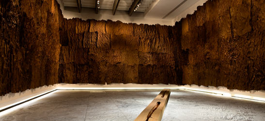


 Sono stato cosi solo, esasperato, e come dipingere uno spazio cosi vuoto-così vuoto è il limite!” (1)